Client
Action for Children
Action for Children is one of the UK’s largest charities, providing help and support for young people through their many services. However, lack of consistent messaging and an inability to connect with key audiences meant that people struggled to understand what they were for.
To coincide with its 150th anniversary, ASHA & Co was asked to develop a clear, simple and engaging expression of who they are and what they do which could ultimately translate to an improvement in their ability to raise funds.
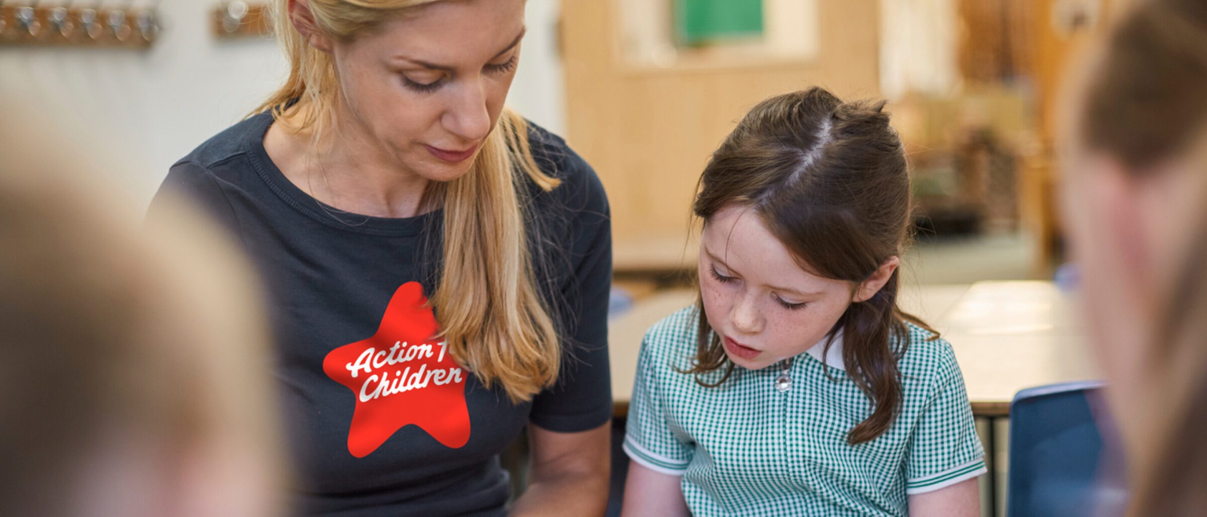
Action for Children operate over 500 local services, the charity's 7,000 staff and volunteers help to improve the lives of 301,000 children, teenagers, parents and carers every year.
Despite being one of the UK’s biggest charities, Action for Children suffered from low brand awareness among their audiences. With inconsistent messaging and a restrictive identity system hampering communication, they lacked relevance and an ability to connect to government bodies and the public. This, in turn reduced their effectiveness as a fundraiser around key issues.
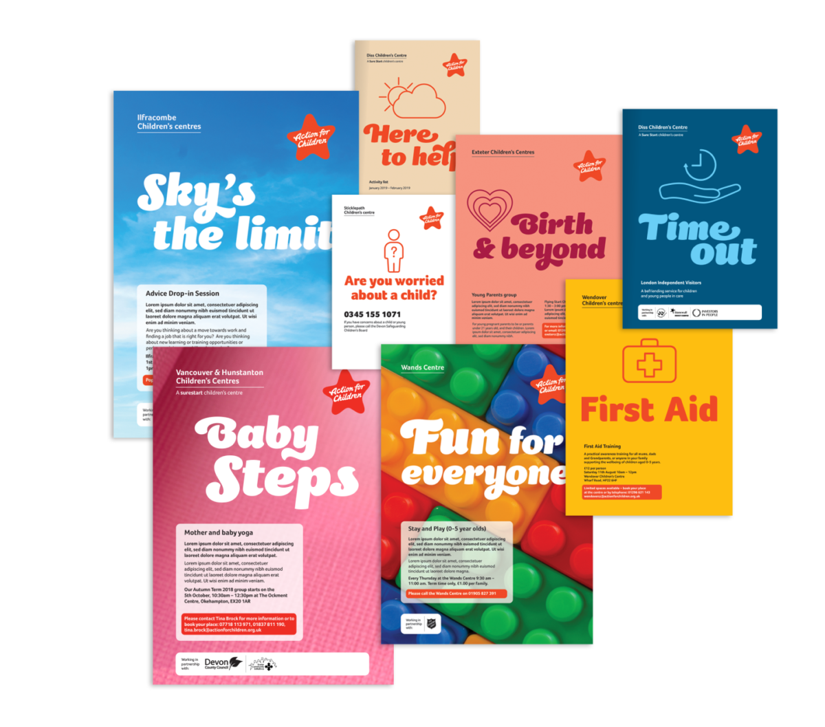
A pragmatic, hands-on approach characterises the way Action for Children works and this inspired us to create the concept ‘We Are Family’. This encapsulates who Action for Children is. It is the way in which they behave in everything they do.
It’s a simple statement of truth that expresses the essence of who they are and how they work. This sense of family permeates throughout the organisation through its staff and all its services. It’s unique to the organisation. It’s what sets Action for Children apart. This concept was the foundation for the creation of a distinctive tone of voice, a series of defining brand principles, the new brand signature and icon.
Marksteen Adamson – ASHA & Co.

To reflect this unique family sense, we developed principles for a new tone of voice that is warm, straightforward and relevant when identifying products and services using language that seeks to engage with people as they would a member of their own family.

It’s really important that we’re able to talk about our work in the same voice. It’s much warmer, much friendlier. We can talk to corporate partners. We can talk to government. We can talk to mums and dads. We can talk to carers. We can talk to children and young people.
Nick Jones – Managing Director of Fundraising, Communications and Policy – Action for Children
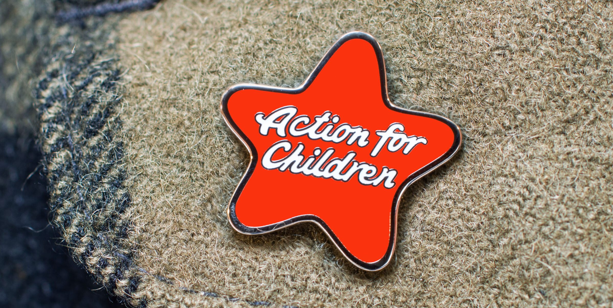
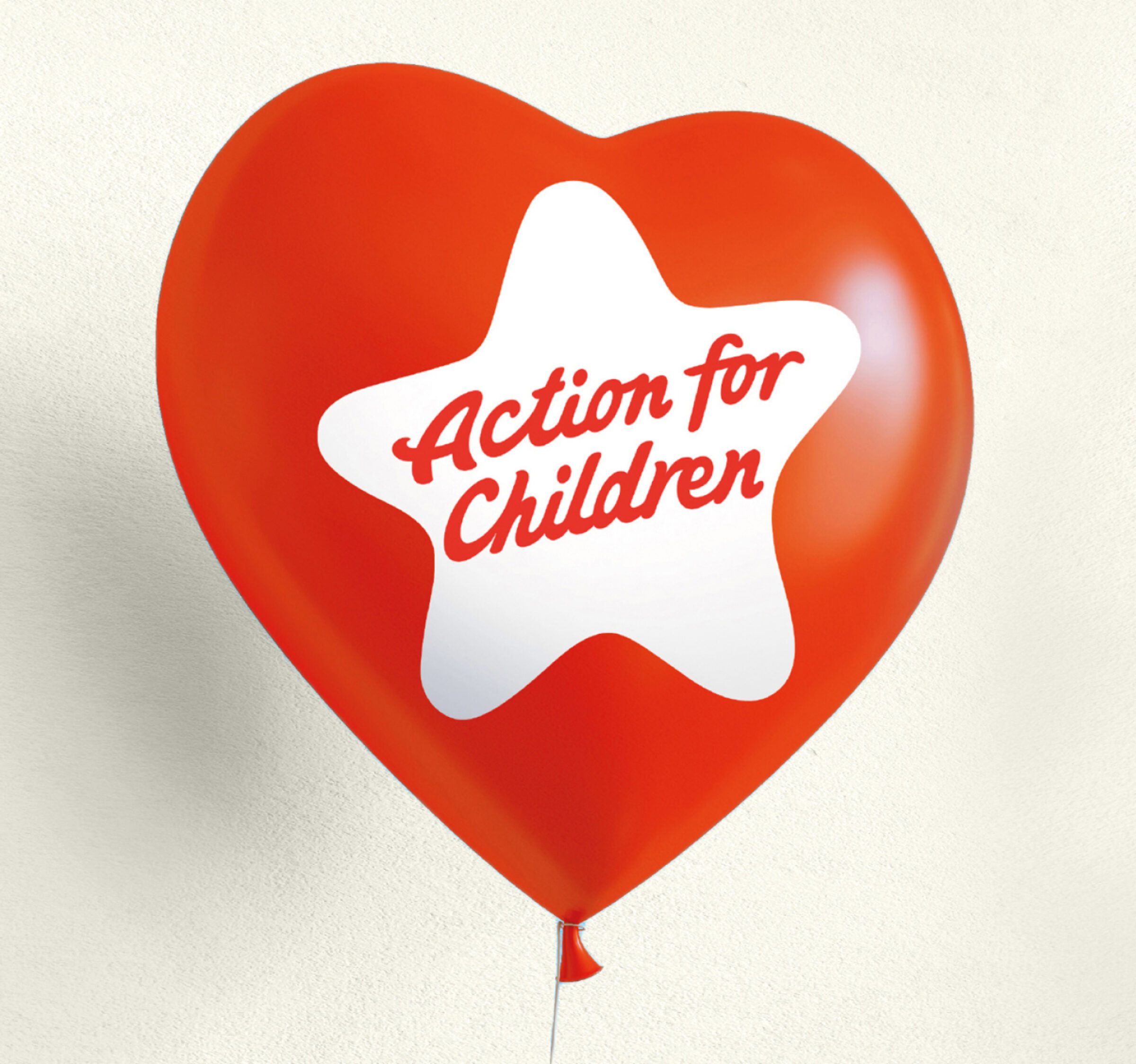
One of the key challenges we faced was that the name of the charity is also a statement. We created a distinctive signature set within a playful star shape to reflect the warm, friendly and accessible character of the organisation.
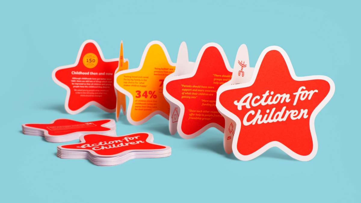
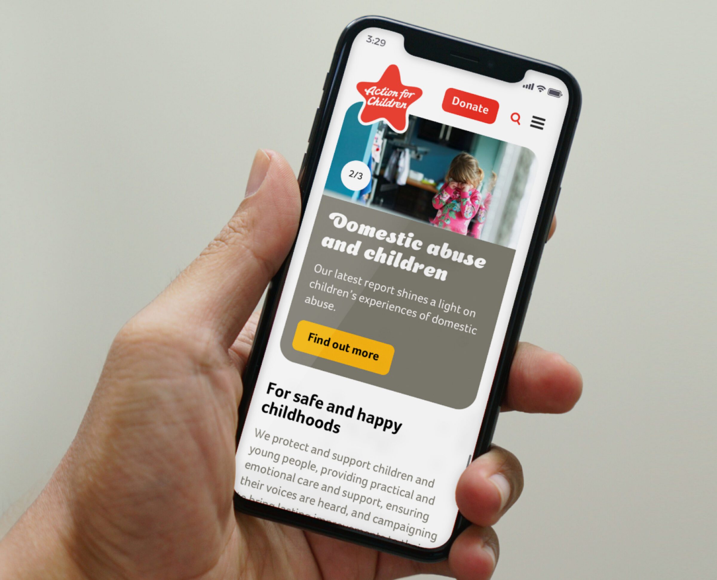
This icon is recognisable from a distance and can sit on a wide range of colours, photography and illustration. Creating this ‘badge’ has liberated the organisation to communicate with flexibility, vibrancy and variety.
Supporting the mark is a strong colour palette featuring a warm red to signify ‘Action’, friendly typography and a curated bank of imagery. Branded templates for all communications requirements have been created and hosted on an internal portal allowing local services to create materials according to specific local needs. This has helped bring the 500+ services across the country together as part of one big, united family.
500+
services across the country
301,000
children, teenagers, parents and carers’ lives improved every year
7,000
staff and volunteers
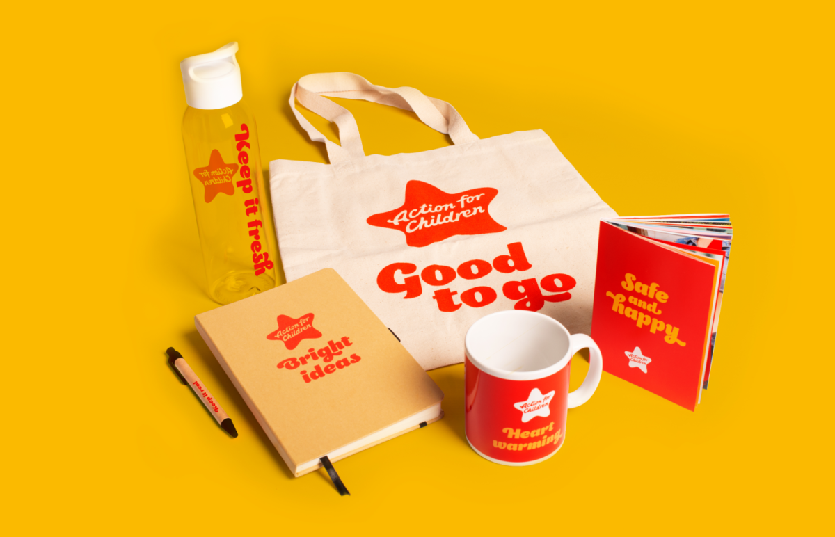
To launch the brand internally while maximising external impact, we identified a series of carefully chosen items that would be given to staff. These items all have a positive message that conveys the personality of the brand.
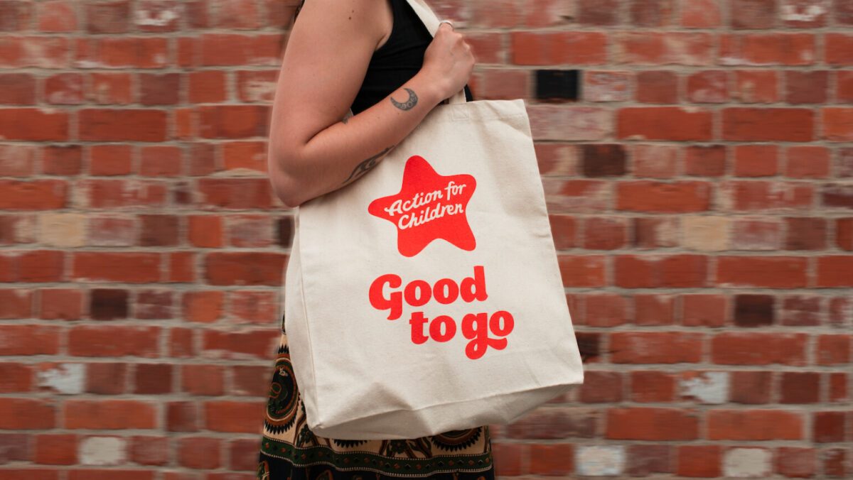
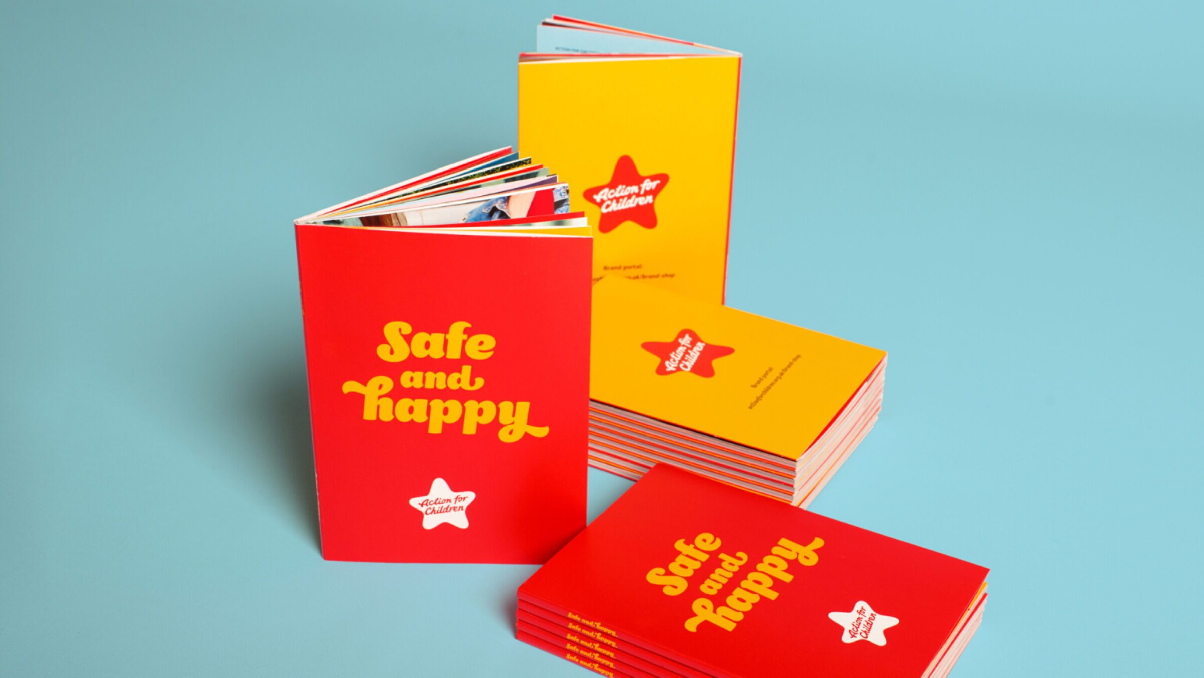
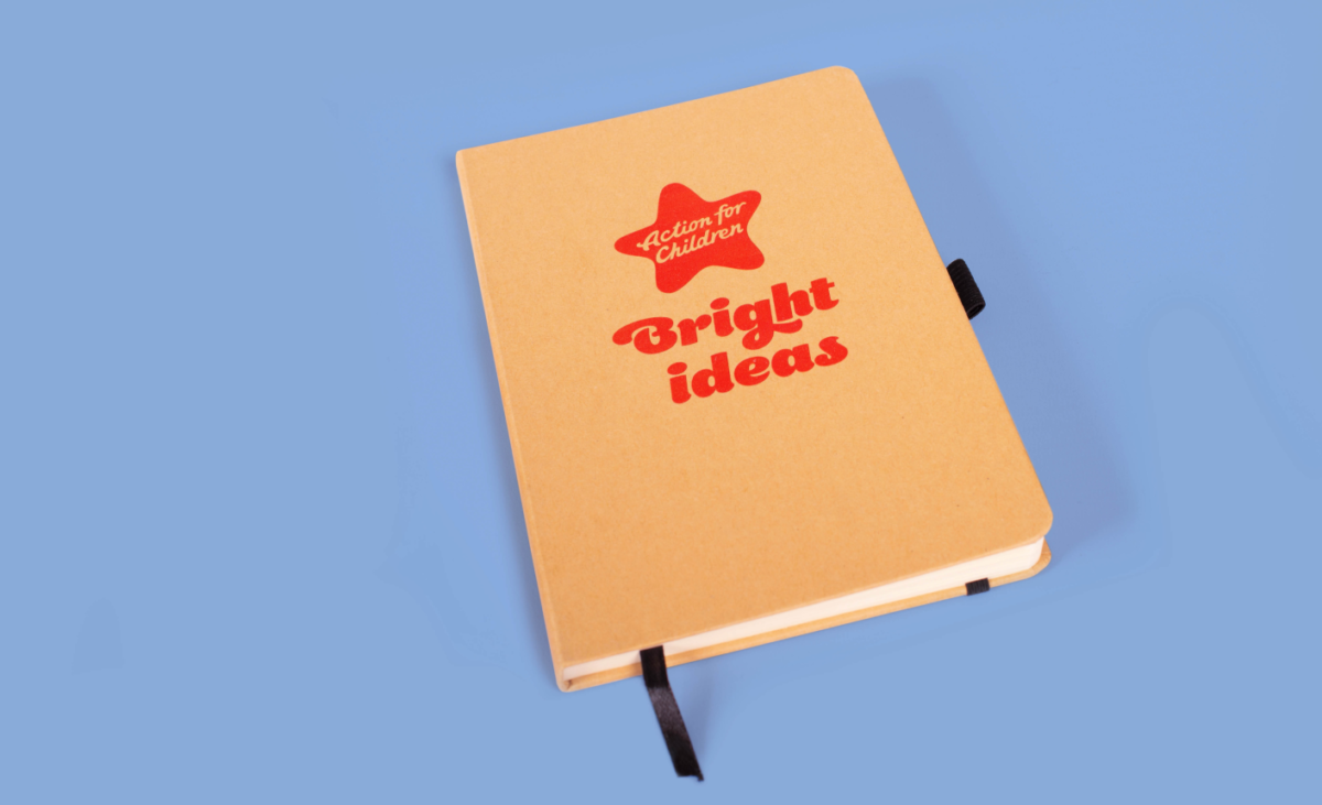
The purpose of these branded products is to enable everyone in the organisation to carry the brand wherever they go, at work, in town and at home. The staff have always been the brand and by wearing and using relevant branded items externally they also become the perfect visible brand ambassadors.
Marksteen Adamson – ASHA & Co.
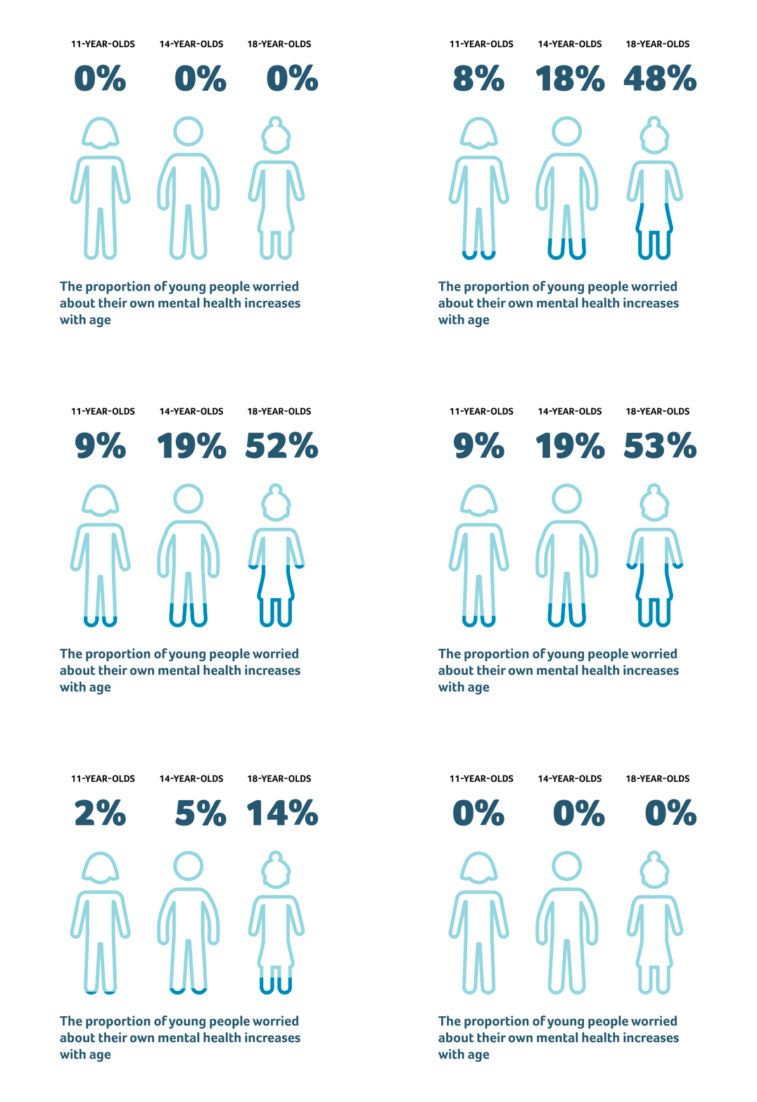
To help the organisation communicate more authentically the challenges that many children face, a suite of curated photography was introduced. In addition, a new, softer illustration style was also developed for the creation of information graphics.
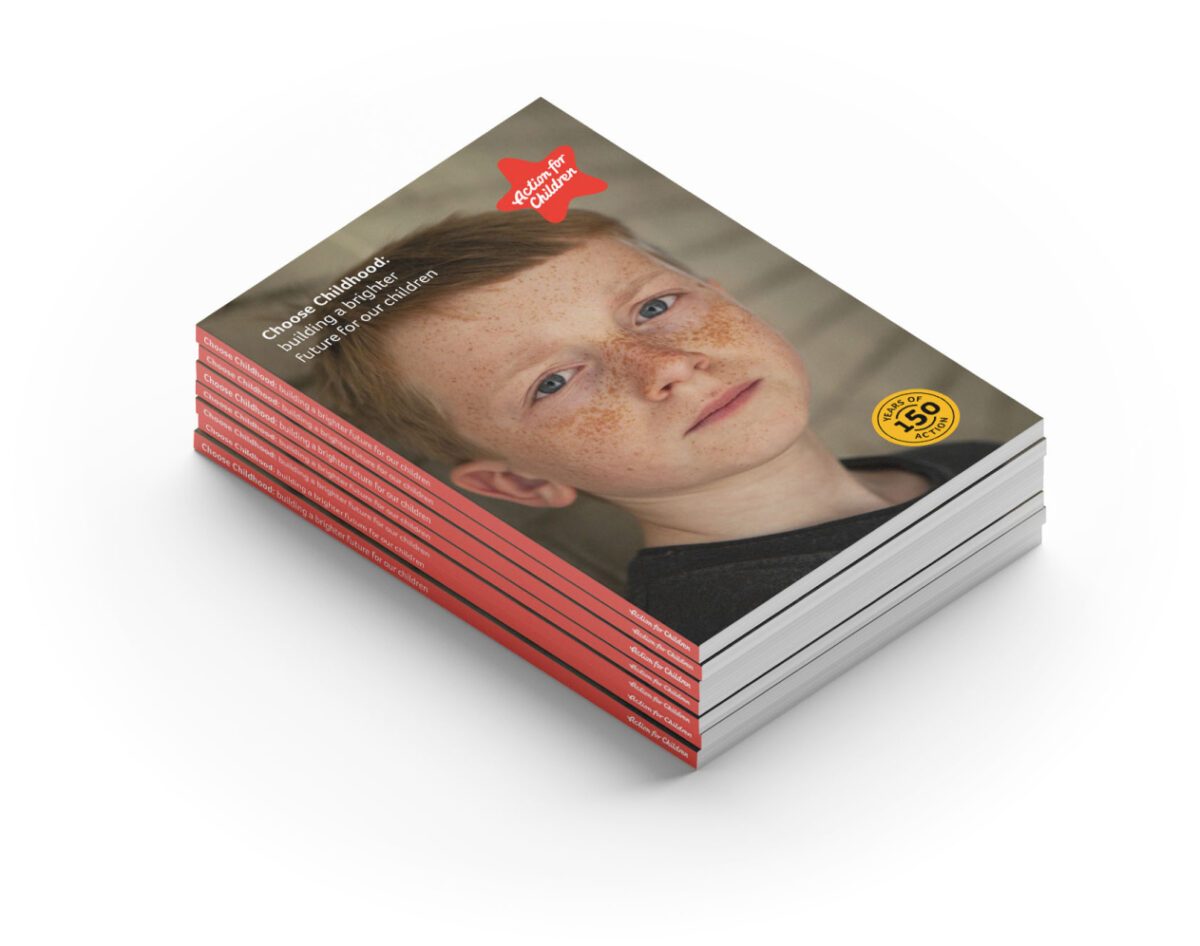
Extensive brand identity work has been done by ASHA & Co on the overall brand strategy, corporate identity and communications collateral since appointment. However, the logo itself was donated to the organisation free of charge as part of a bigger donation, demonstrating its commitment to the great work that Action for Children does.
