Client
Kolectiv
When co-owners Paula and Cat launched their beauty salon in the heart of Cheltenham, they required a name and brand identity that would reflect their approach of only using organic, sustainable products that were in harmony with nature. Providing hair and beauty services to a selective clientele, they would also need to partner with skilled stylists and beauticians that would extend the range of services they offered. We developed the identity and brand positioning as part of our ongoing commitment to support small-scale businesses starting up in the local area.

With a number of well-known, publicity-shy clients and a ‘word-of-mouth’ approach to the promotion of the salon, we needed to position the new brand as ‘discreetly high-end’; bringing a contemporary elegance to the look and feel of the salon’s identity. The name had to be a unique expression of the approach, which offered the expert services of a group of highly skilled stylists.

We created the name Kolectiv to suggest this coming together of like-minded expertise, while the idea of ‘Naturally Beautiful’ encapsulates the idea of a more wholesome, balanced approach to health and beauty.


To reflect Kolectiv’s affinity with the beauty of nature and natural products, a suite of original images featuring detailed, photographic portraits of plants and flowers was created by ASHA & Co. We experimented with lighting and texture to evolve a set of signature images that subtly reference different styles and types of hair. The photographs create the connection between the diversity of Kolectiv’s clientele and the skills of the practitioners.
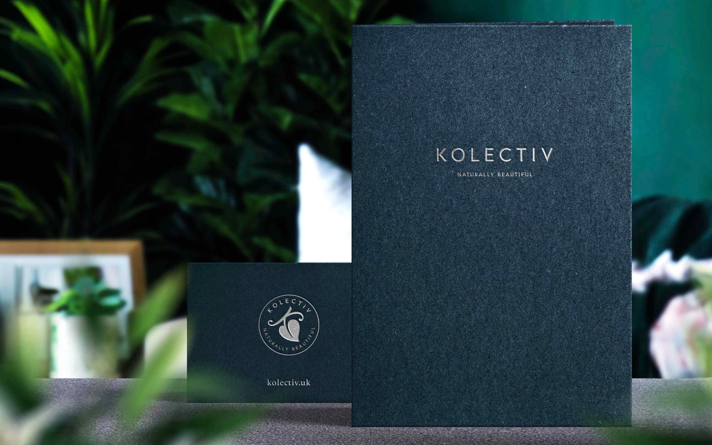
With the photography expressing diversity and richness, a clean, confident wordmark was designed to suggest elegance, simplicity, and balance.


A roundel featuring an organic illustration of a leaf with a subtle ‘K’ motif supports the main identity and is used as a stamp on collateral.


To bring the brand positioning to life while keeping materials fresh and distinctive, eighteen variants of appointment cards were created.
High production values were applied to all Kolectiv collateral to ensure a premium look and feel for the new brand.


The subtle colour palette features a range of dark, natural tones and this has been utilised in the signage application of the fascia of the salon to present an elegant but discreet exterior.

The organic K motif and natural hues of the colour palette play into the interior of the salon where plants and natural materials are used to create a tranquil, calming environment.


Large-scale prints of the plant portraiture feature throughout the salon space to help bring a sense of nature into the working environment.


ASHA & Co took the time to really understand the ethos at the heart of our business. They translated this into a brand that expresses what we do in an elegant and original way.
Paula & Cat – Kolectiv
The organic ‘K’ symbol provides the brand with a robust, visual shorthand useful for profile images and as a favicon.
