Client
Pod Point

Pod, formerly known as Pod Point, had reached a critical point in its journey. As a leader in EV charging solutions, the brand had built a strong reputation built on product reliability and its large, UK network of public chargers. As a result, their identity was anchored in a product-led narrative, lacking the flexibility needed to support future ambition. Pod needed a brand that could reflect its broader vision – one of community, and a shared future of clean energy that benefits everyone.
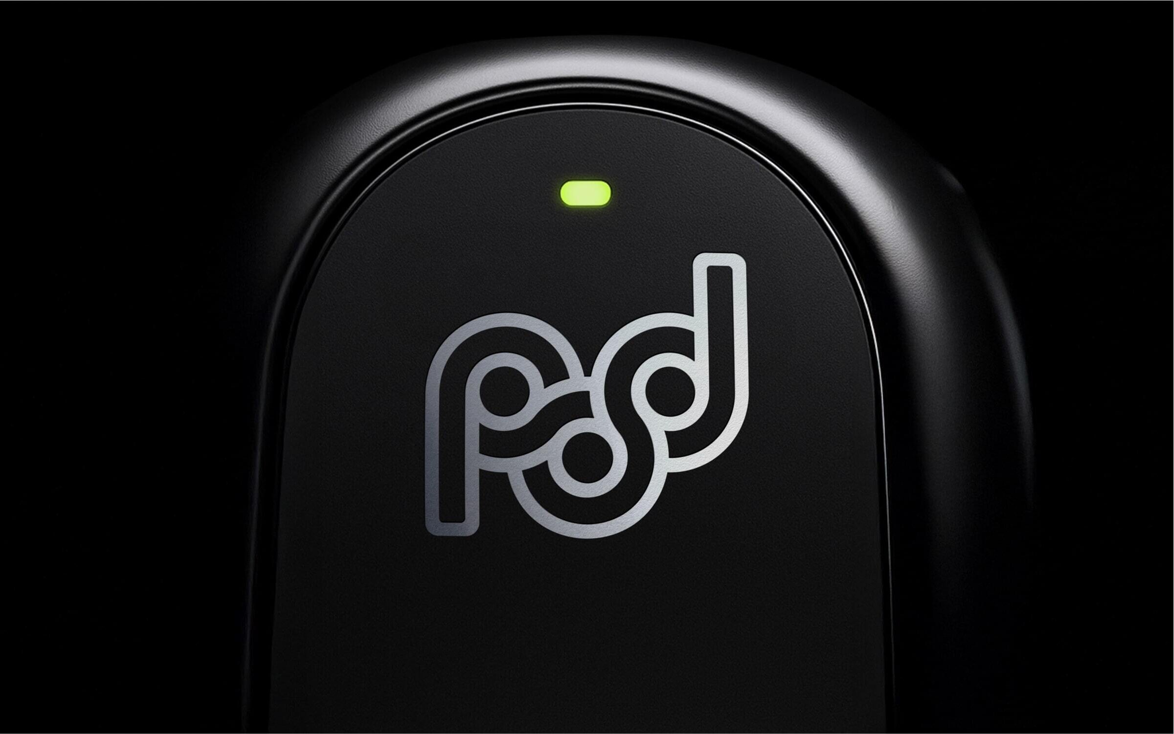
POD POINT min
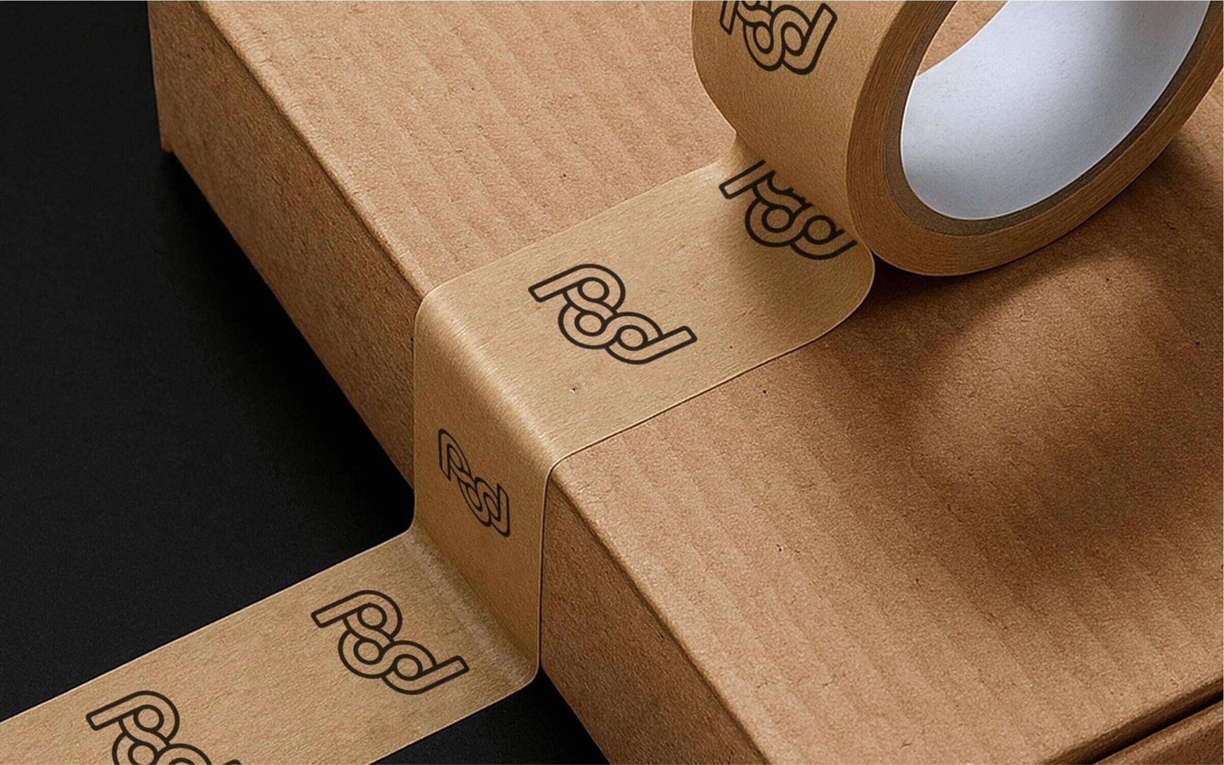
POD PACKAGING min

The challenge

The original Pod Point name evoked a sense of a singular, product-based solution. Our challenge was to create a brand that felt open and inclusive – one that could adapt and grow as the company’s ambitions evolved. It needed to resonate with a wider audience, shifting the focus from product utility to a shared energy experience, while still retaining their authority as one of the UK’s largest EV charging companies.

Our approach

By transitioning the name to Pod, we freed the organisation from being the title of a product, giving it the ability to expand its brand architecture to encapsulate a broader spectrum of services, from hardware to innovative charging solutions, under a unified identity.

The concept of ‘Power of the People’ became central to the brand narrative, positioning Pod as an enabler of clean energy access for all. This shift created a strong foundation for visual, verbal, and experiential elements that supported the idea of community and inclusivity, while also allowing for a disruptor mindset within the sector.

A Vibrant Visual Language

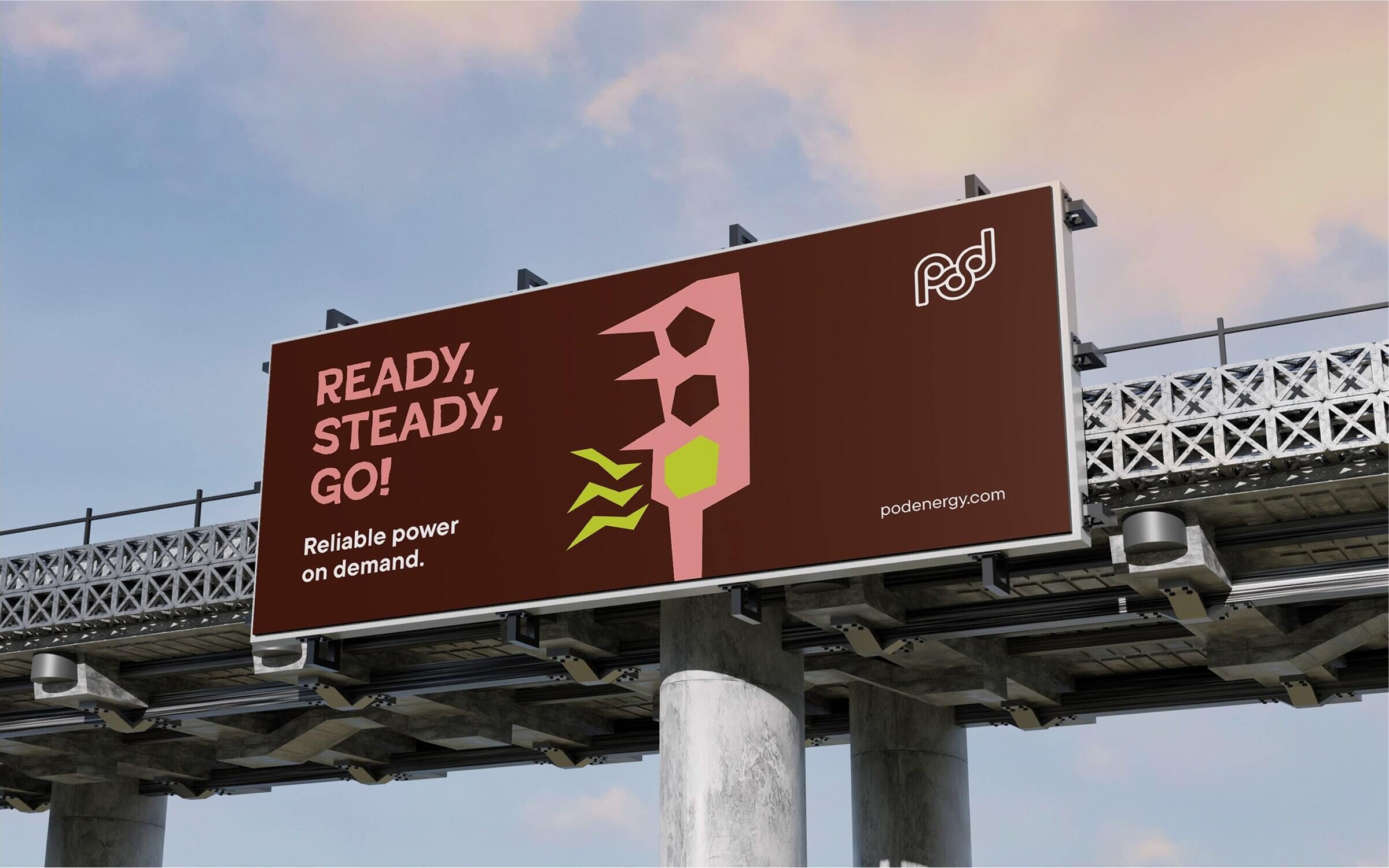
Drawing inspiration from the world of Pop-art and social movement, we developed a graphic style that is expressive, playful, and rooted in human connection. Together with a bold, new colour palette, the ‘cut paper’ illustration style brings a sense of spontaneity and optimism, ideal for campaign messaging.

To balance this playful approach, we introduced clean, modern typography that gives the brand authority and sophistication. The use of a clear, geometric font creates a confident voice that supports both messaging and product presentation.

POD BILLBOARD min

To give a sense of the brand at work, we curated suites of images showing moments of everyday life. These helped to convey Pod as the thread of energy seamlessly woven through its customers’ lives – enabling and reassuring.

Speaking to the Community

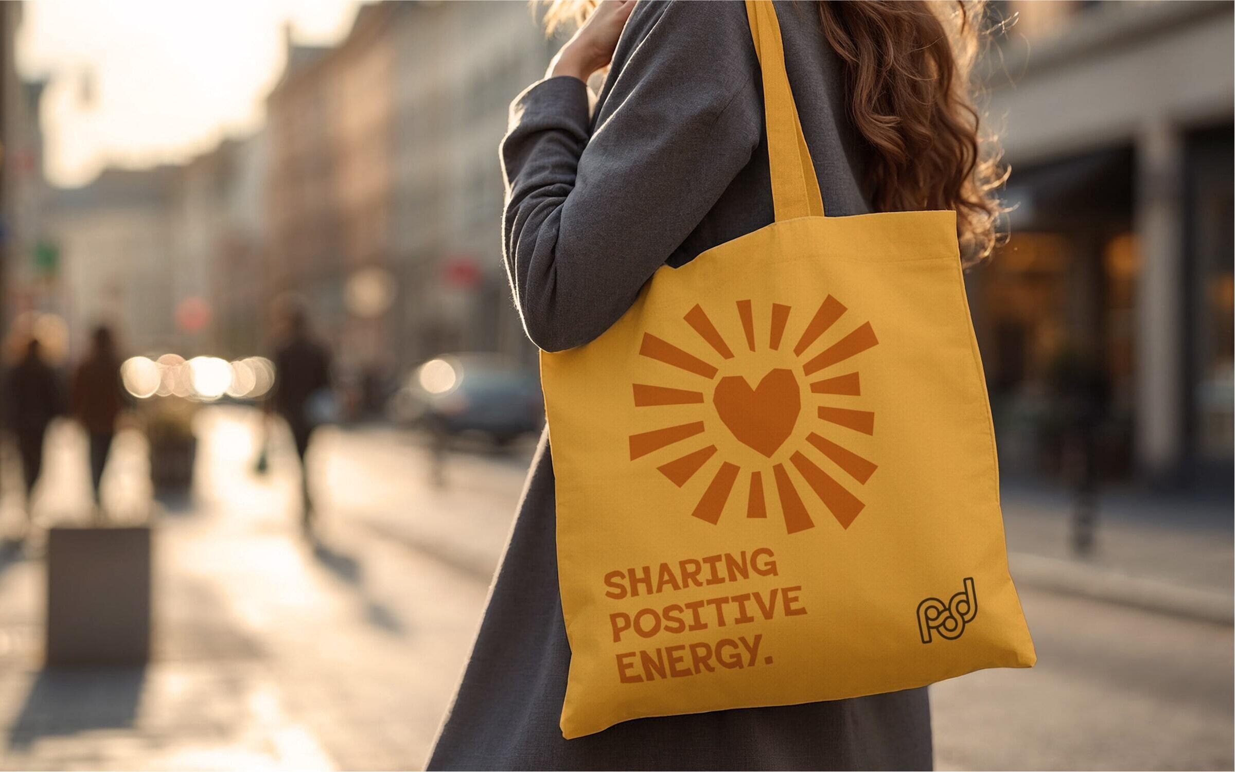
Pod’s new tone of voice is punchy, engaging, and inclusive. It speaks to the collective rather than the individual. This community-first approach is driven by the idea of ‘Enabling everyone to share positive energy’, making the brand engaging and aspirational, ensuring that everyone feels part of the movement. The language is deliberately simple, short, and impactful – designed to resonate with a mass audience and inspire action.

POD TOV
POD TOTE min
POD ENVIRONMENT min
Group 38120
Group 38119

Elevating the Product Experience

While the visual identity focuses on community and energy, we also wanted to ensure that design of the products was celebrated. We developed a black-and-white visual aesthetic that transforms charging products into desirable lifestyle objects – ones that customers can feel proud to use and showcase.

Unlocking future potential

The rebrand not only transformed Pod’s identity but also created a robust framework for future growth. With a flexible brand architecture, Pod can expand its product range, form new partnerships with key players such as EDF and car manufacturers, and establish itself as a force in the clean energy movement. The visual and verbal assets now support a consistent and scalable brand experience that is both disruptive and community-driven.

POD SHOWROOM min

All the visual elements were showcased in a launch campaign for the new brand. This was led by a brand video which used the idea of an EV journey to highlight the new brand and its aspirations. A full suite of visual assets, along with comprehensive guidelines, was supplied to media agencies who we then art directed to ensure consistency across the campaign.

Through our collaboration, Pod has emerged with a new identity that reflects its purpose and ambition. The brand’s transformation from Pod Point to Pod represents more than a name change – it signals a shift toward a future powered by shared energy and collective progress. Pod now stands as a vibrant, people-first brand ready to lead the charge toward a cleaner, more connected world.

A huge thank you to the entire ASHA team for your creativity, clarity and partnership in bringing the new Pod brand identity to life. We’re excited to see it out in the world and hope you’re just as proud of what we’ve achieved together. This really feels like the beginning of an exciting new future for the business.

Melanie Lane – CEO of Pod