The RSPB is a 130+ year-old charity responsible for a huge range of activity, from the reintroduction of iconic species like the osprey, to landscape-scale conservation you can see from space. The challenge was to show how the RSPB was responding to a changing world to engage fresh audiences and inspire a new generation. Working with the leadership team we articulated the RSPB’s vision for an active, inclusive future, rooted firmly in its past and recent legacy.
The RSPB’s scale means it is uniquely placed to see the challenges facing the natural world. We developed the driving idea ‘A bird’s eye view’ to help shape all their communications. We created the positioning ‘Action for nature with a bird’s eye view’ to express how their unique perspective enables them to work.
To allow the RSPB to communicate its objectives more clearly, we helped them surface four distinct areas of activity: ‘We act, we influence, we collaborate, we empower’. This enabled them to engage audiences in a more direct and purposeful way.
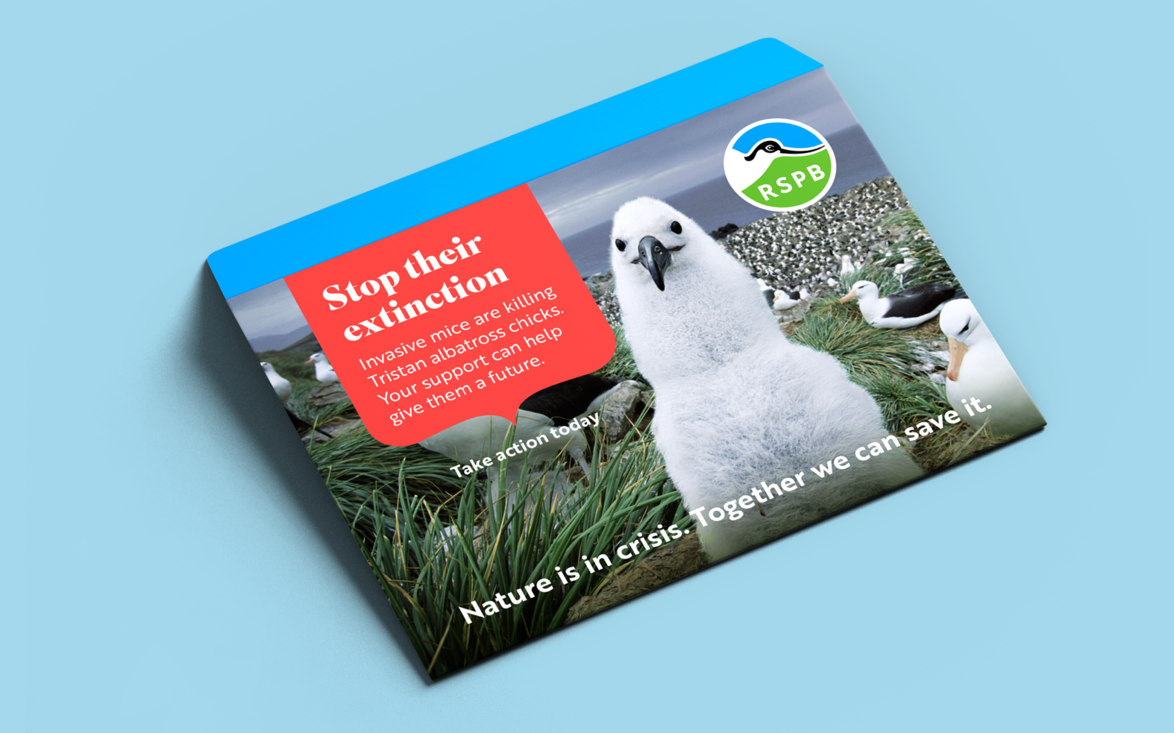
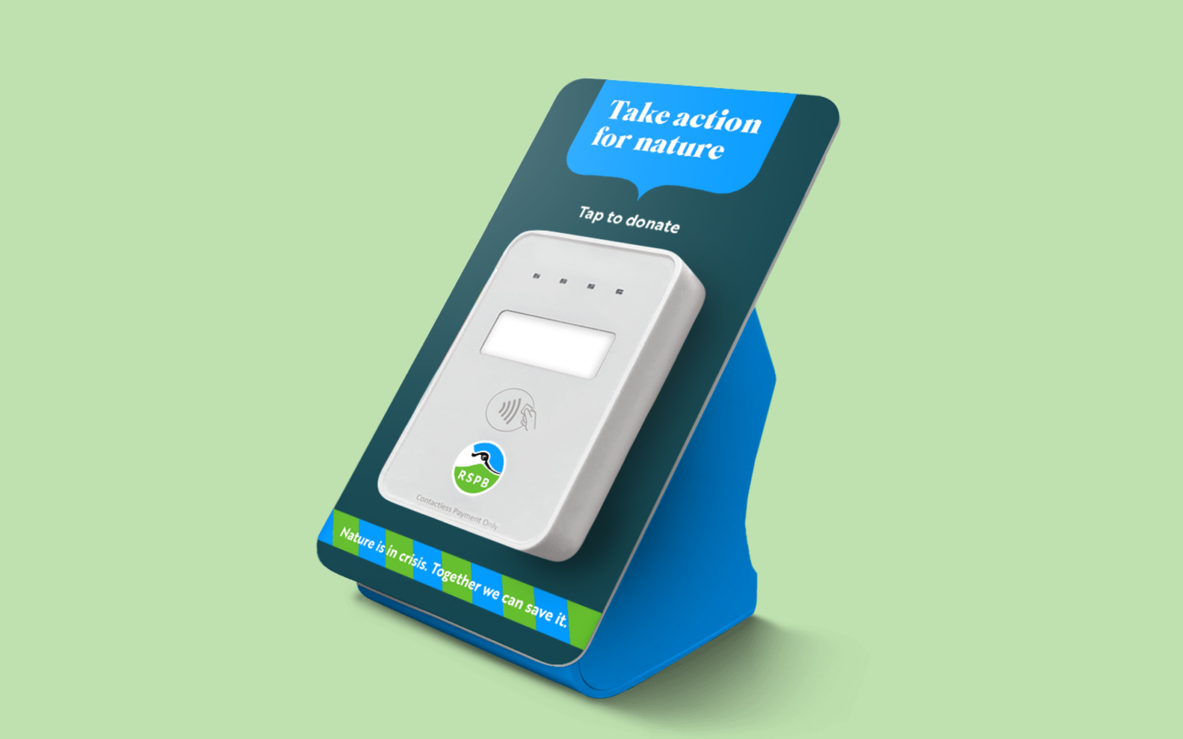
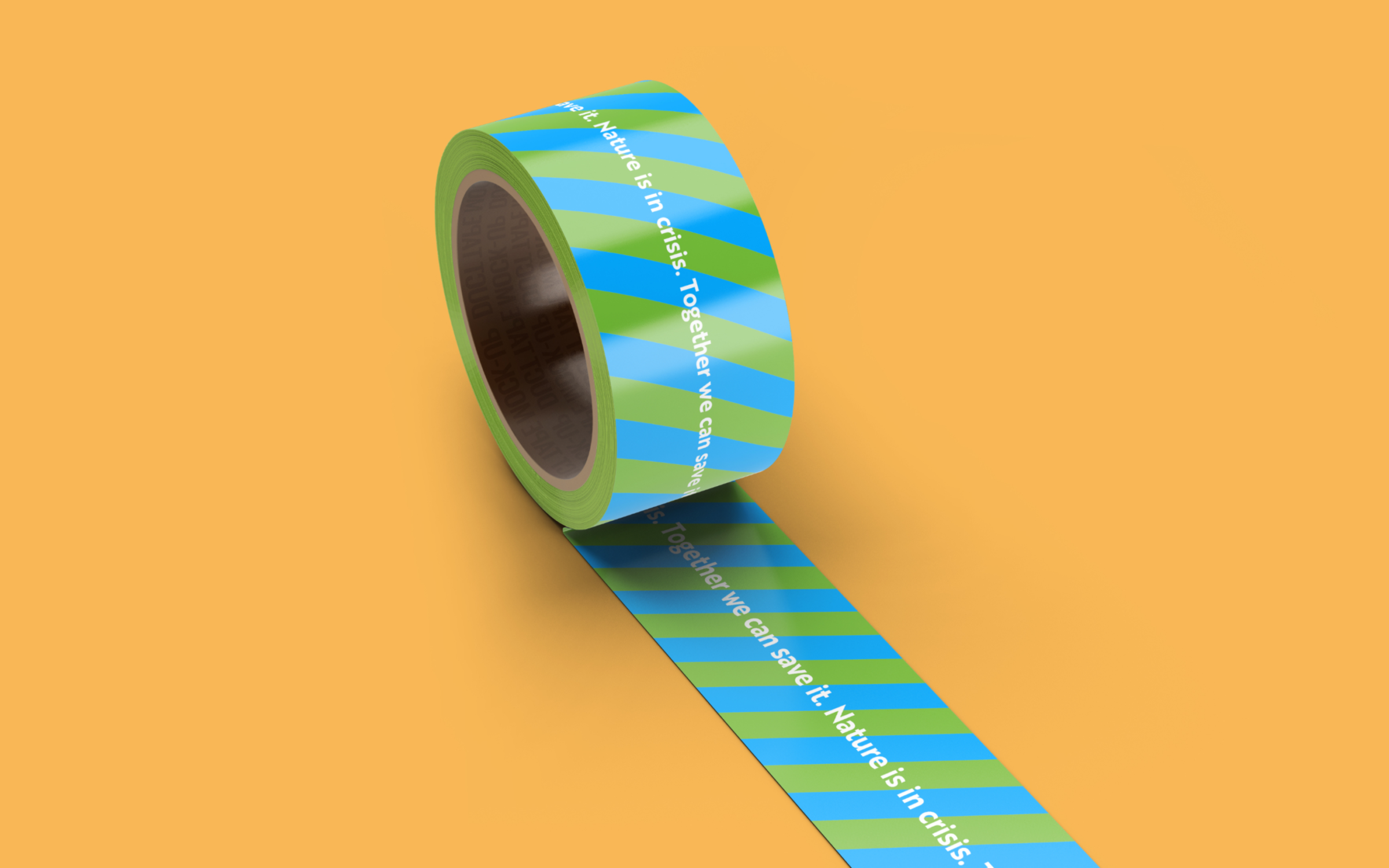
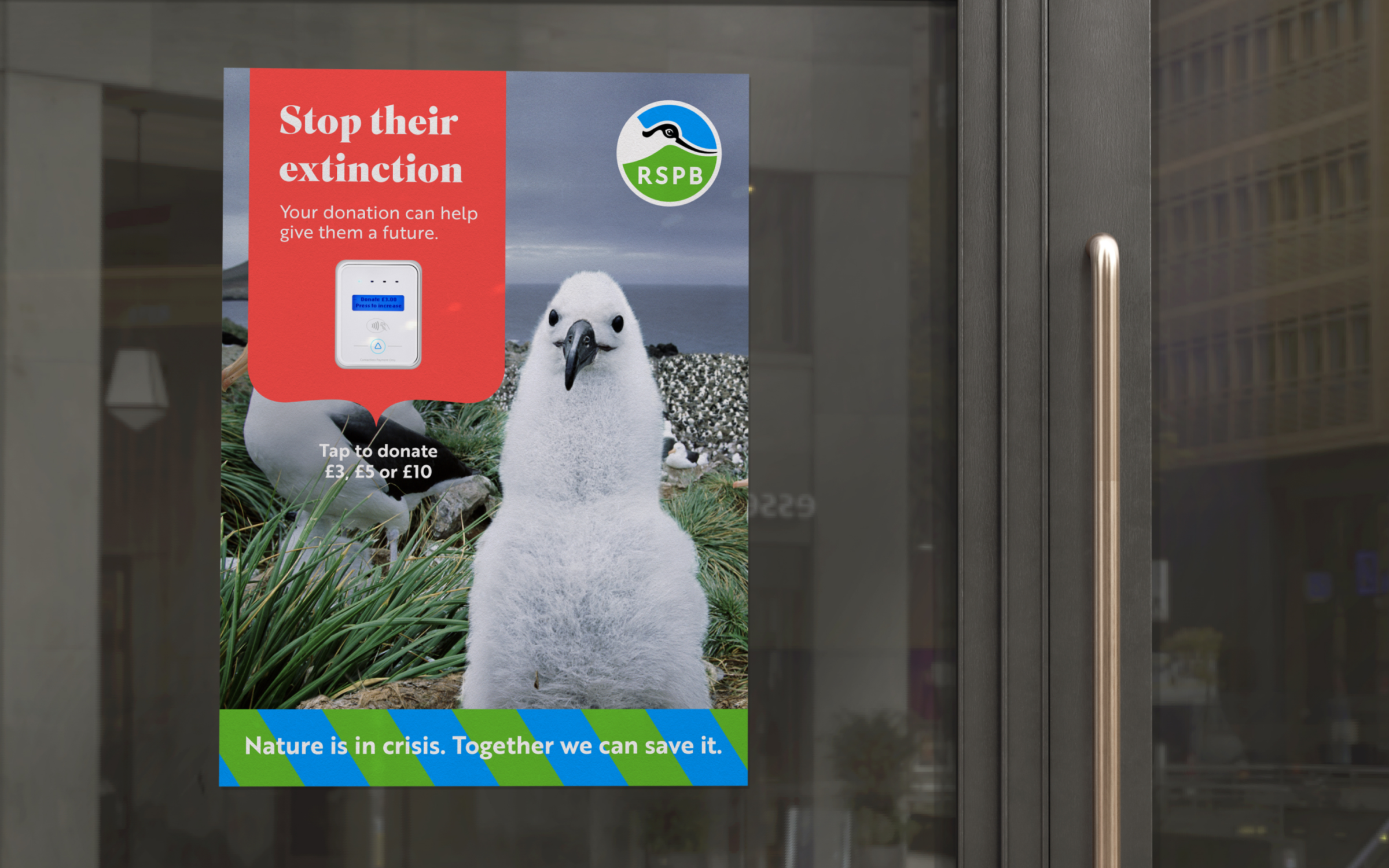
We wanted to help convey the urgency of the twin crises facing nature and the climate, coupled with a sense of hope that there is still time to act. ‘Nature is in crisis. Together we can save it.’ gives the RSPB a bolder, more influential voice to champion nature’s cause.
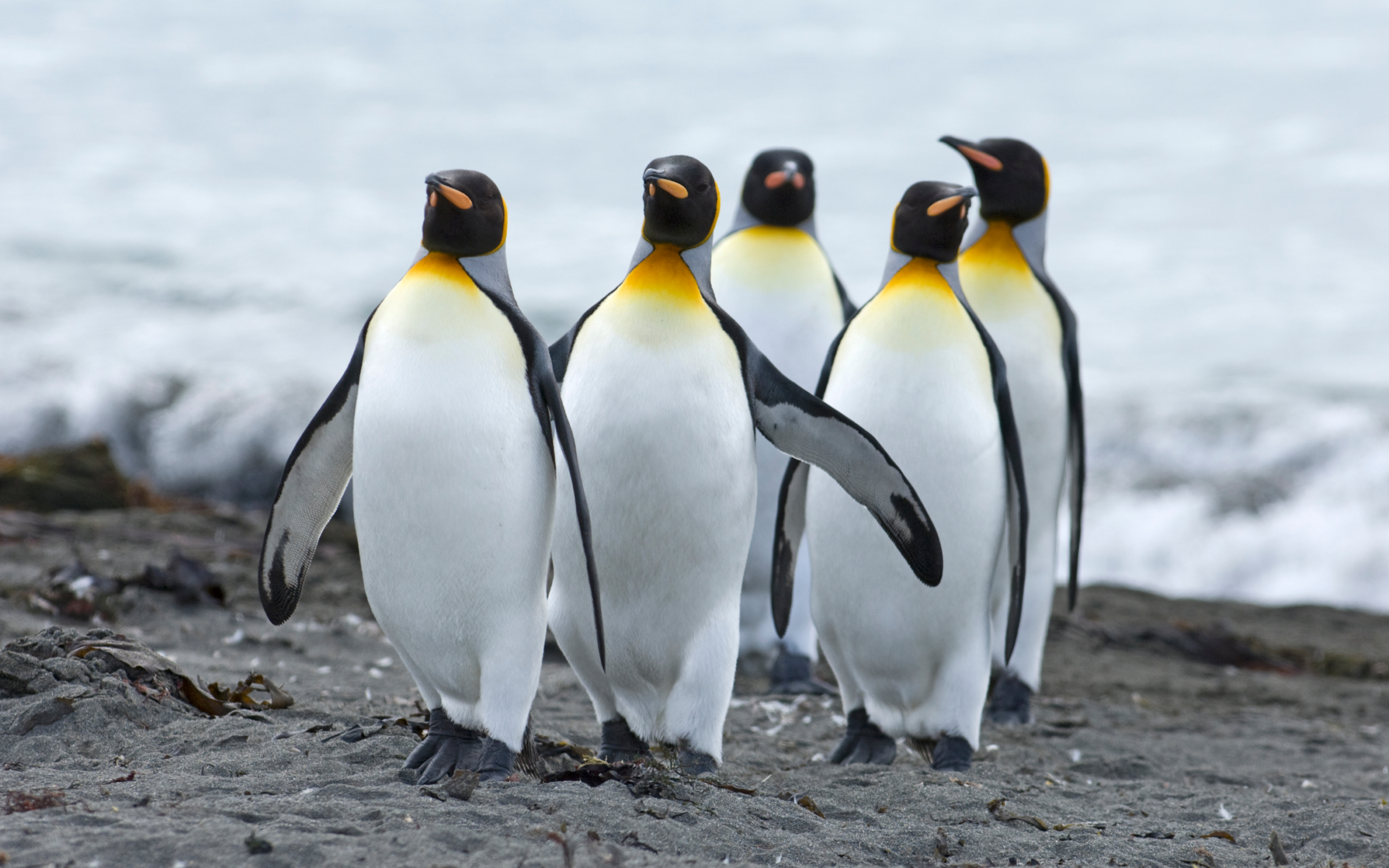
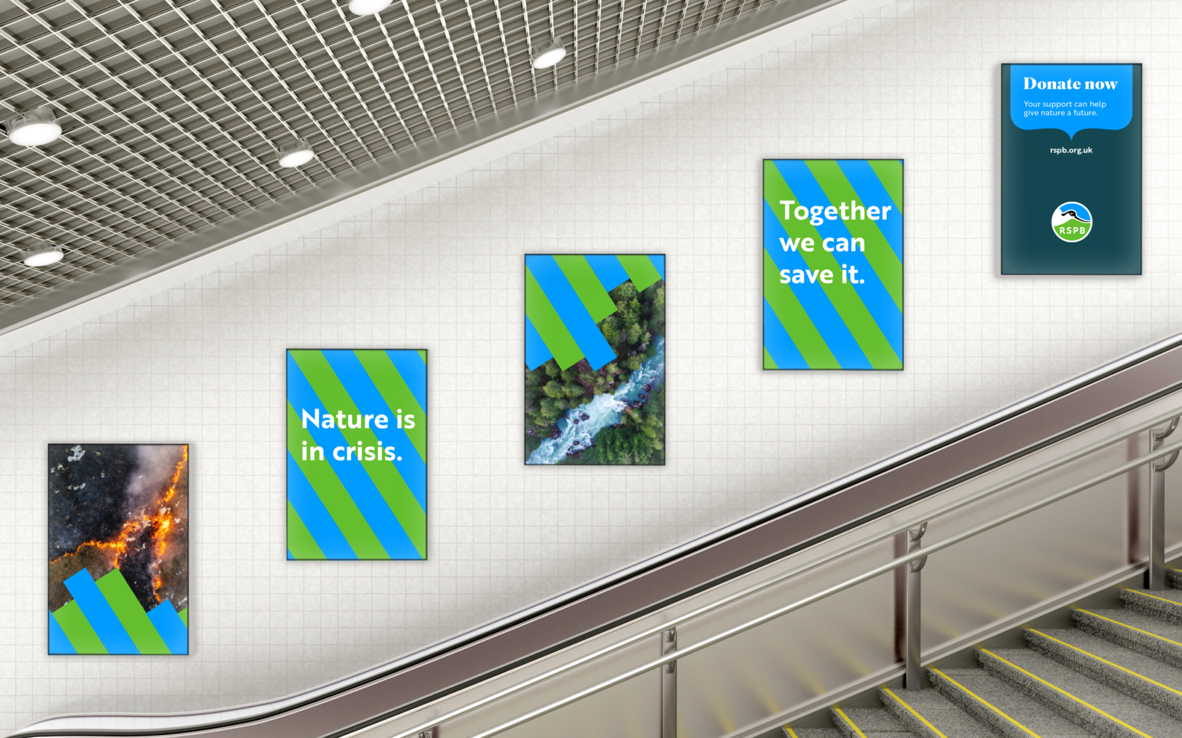
We developed distinctive ways of using photography that would show the RSPB’s ability to bring their unique perspective to the issues facing our natural world. In this way ‘A bird’s eye view’ was expressed with aerial (macro) images coupled with highly detailed (micro) photography.
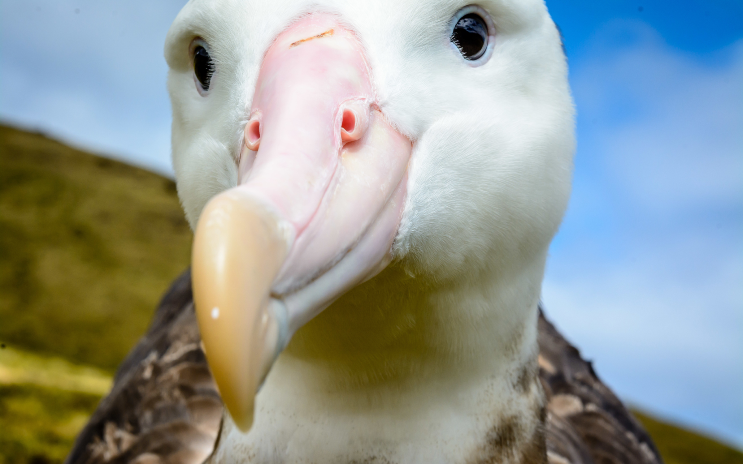
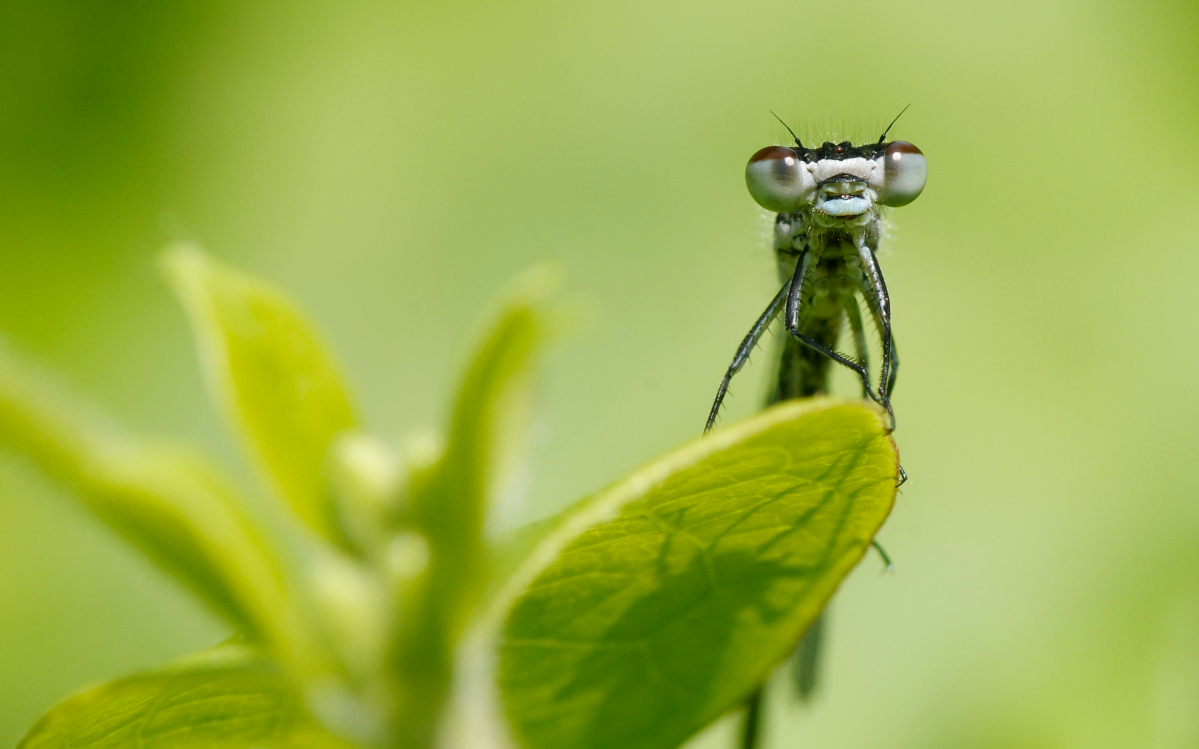
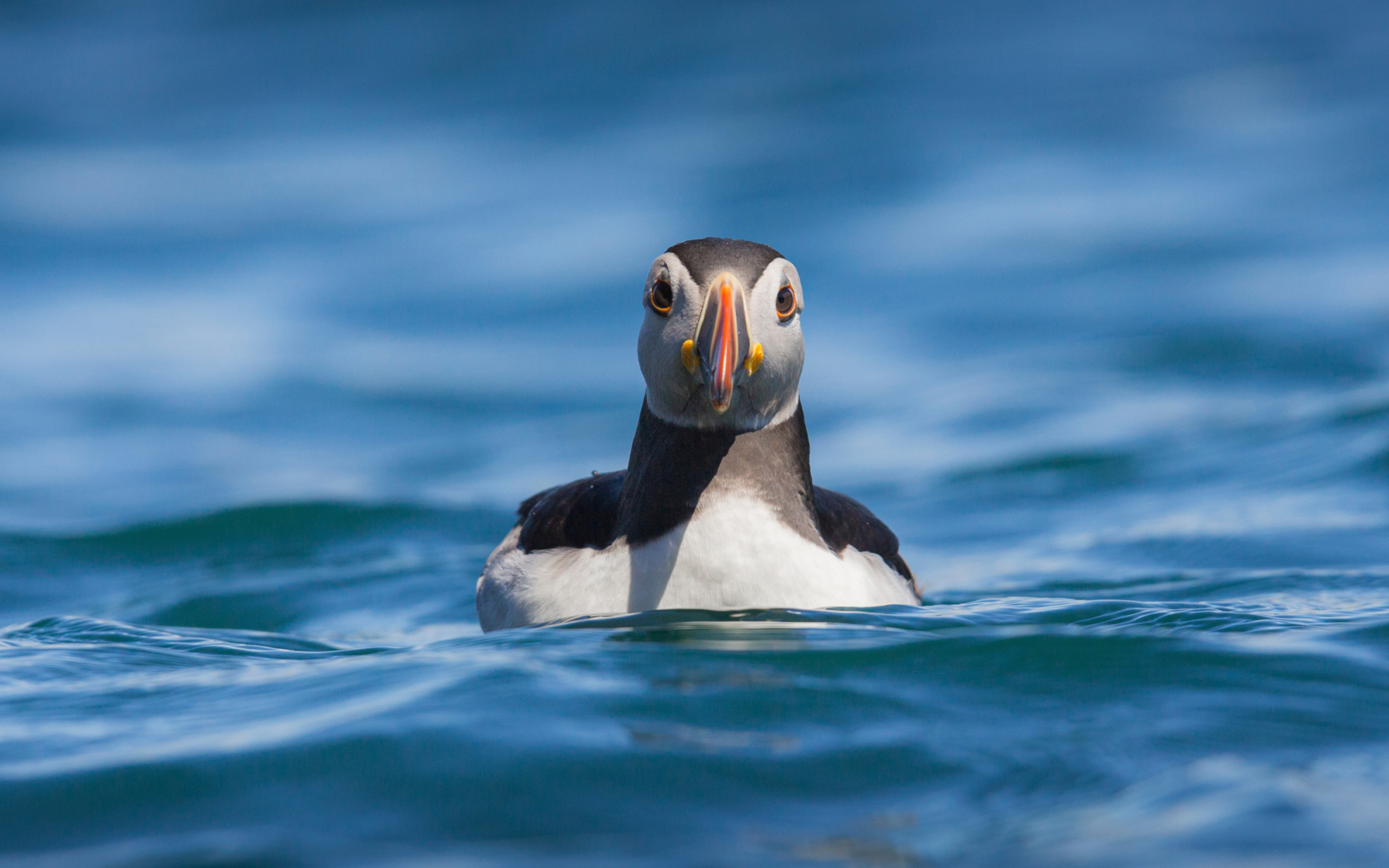
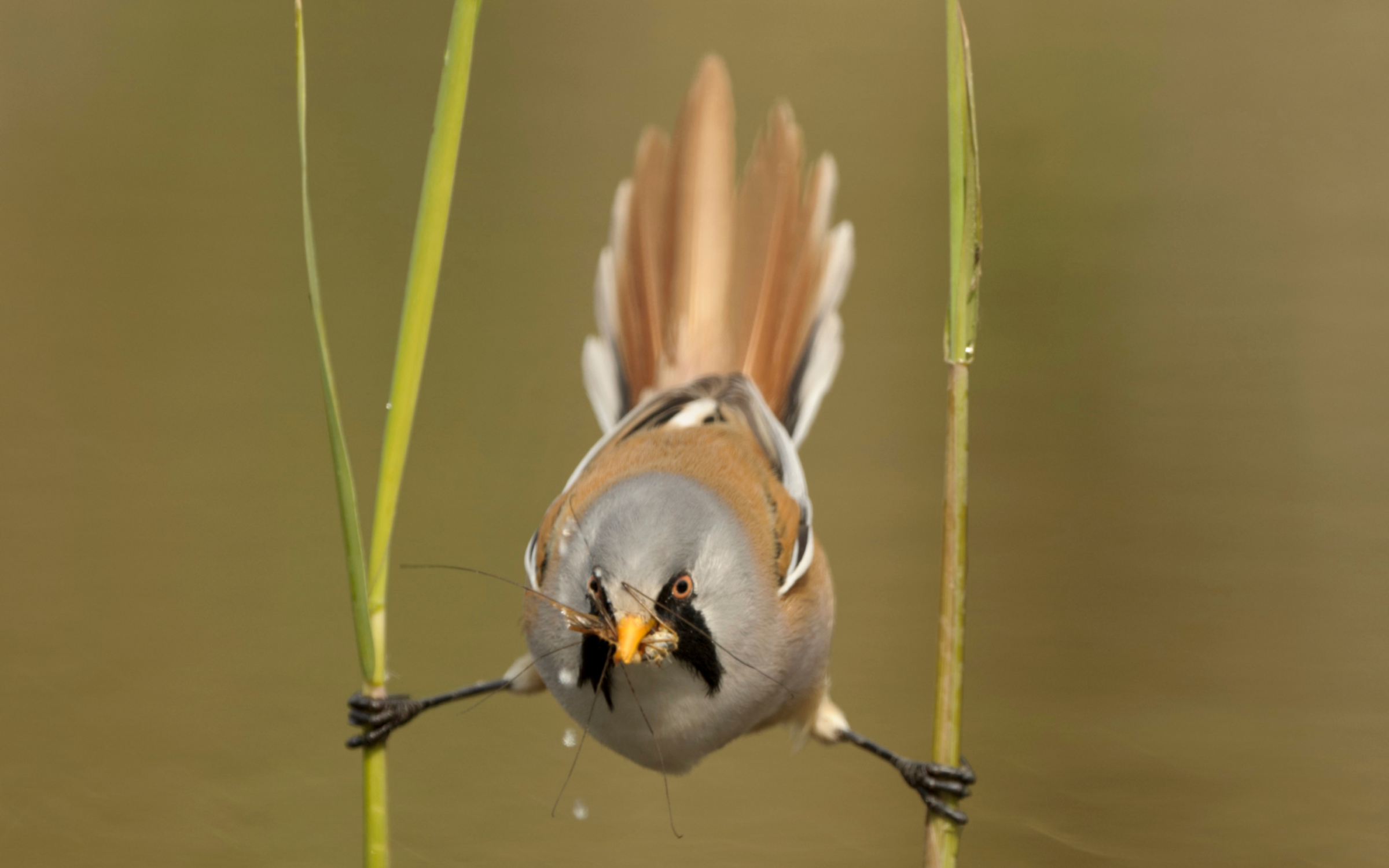
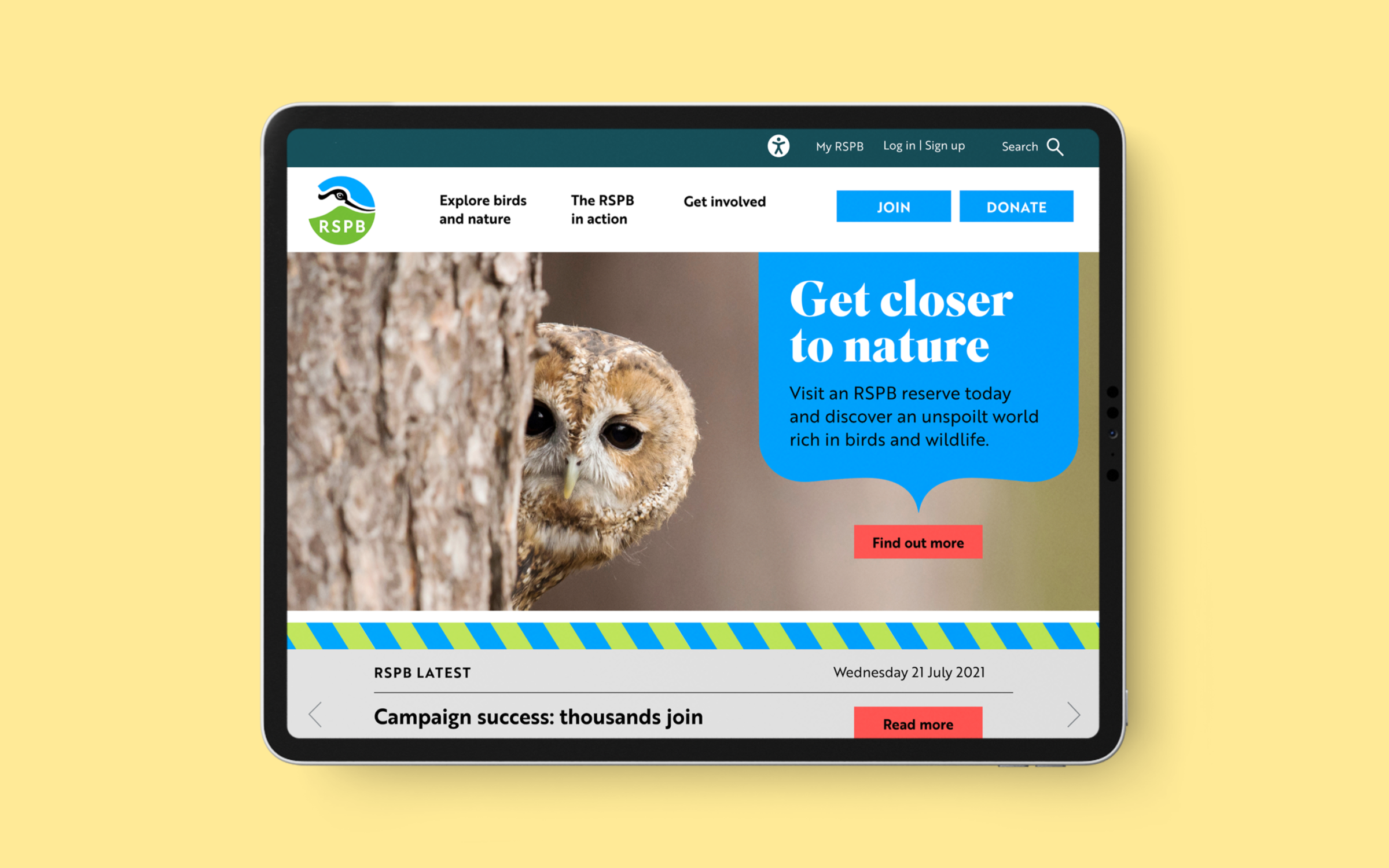
In addition to these signature styles, we wanted to create a sense of engagement between people and species at risk. ‘Human connection’ photography shows animals looking into the camera and helps the viewer identify and empathise with species, giving them a deeper connection to nature.
In developing the new logotype, we reimagined the iconic avocet mark
to incorporate land, sea and sky, giving environmental context to the
wildlife the RSPB works so hard to protect.
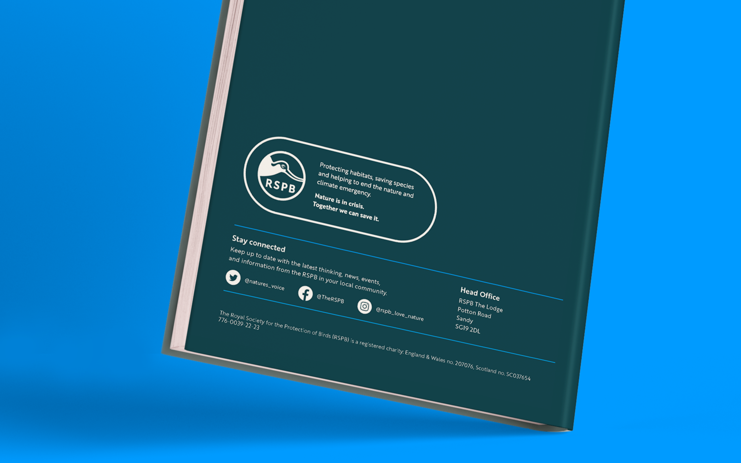
The new colours incorporated in the brand mark form part of a wider palette derived from natural elements: land, water, sky and an alert red to command attention.
We developed a distinctive ‘wingspan’ panel to create impact for headlines and direct viewers to action. The parenthesis shape at the base of the panel deliberately echoes a bird looking down.
To introduce the new identity and strategy, we created a brand story which brought to life the organisation’s journey and the vision for the future.
The tools, training and guidance we provided continues to enable the RSPB to maintain clarity and consistency as it continues its roll-out of the new brand.
The RSPB has four national authorities, multiple divisions and operates many local branches, campaigns, and activities. We created a straightforward brand architecture within which all levels of the organisation could be recognised.
The RSPB’s work is based on strong foundations of scientific evidence so the presentation of statistical information was a key deliverable. We developed a way of showing information that could be dynamic, engaging and visually appealing.
The RSPB thinks, speaks and acts, both long term and big picture. Like nobody else. And we bring together – with our unique bird’s eye view of the world – all the tools needed to tackle the biggest challenges the planet faces.
Beccy Speight – CEO, The RSPB
A brand identity that will help us differentiate ourselves to be able to stand out and stand up for nature.
Ceri Dunne – Head of Strategy, Knowledge and Innovation at The RSPB
The work ASHA & Co did helped us to establish real clarity in how our brand can bring our future strategy to life. ASHA & Co worked with us to give us a really clear, externally focussed brand platform – Our Whys, Our Whats and Our How.
Ceri Dunne – Head of Strategy, Knowledge and Innovation at The RSPB
The avocet is an important part of our story and history and we wanted to retain that but bring it up to date. It now has a vibrancy that will help us stand out, it represents our work on land, skies and seas, and importantly it’s more practical and robust across today’s marketing channels. The design and creation of the logo was donated by our partners ASHA & Co.
Ceri Dunne – Head of Strategy, Knowledge and Innovation at The RSPB
The brand work has for the first time given us the clarity and confidence to go out to the world and truly represent what the organisation stands for. This has enabled us to communicate with passion, urgency, and hope.
Ceri Dunne – Head of Strategy, Knowledge and Innovation at The RSPB
We are proud and excited by our brand. Working with ASHA & Co we took the time to understand how people perceive us and engage with the RSPB right now. We found that we needed to work even harder at demonstrating that we are an organisation that impact for nature during a nature and climate crisis. The work ASHA & Co did helped us to establish real clarity in how our brand can bring our future strategy to life.
ASHA & Co worked with us to give us a really clear externally focussed brand platform – Our Whys, Our Whats and Our Hows – they brought this to life further by giving us a brand identity that will help us differentiate ourselves to be able to stand out and stand up for nature.
We retained our USP of birds and through that demonstrate that we take action for nature with a birds eye view. The strength of our brand platform is that it gives us the confidence to be the brand that speaks with passion, understanding, trust, hope and urgency. All of which came through in our latest campaign to protect our important nature laws. It helped us move to a place that we can truly show the depth, the breadth and the impact we have for nature on a macro and micro level. Nature is in crisis. Together we can save it."