Client
The Wilson – Cheltenham Art Gallery and Museum
As part of a £6million redevelopment plan, Cheltenham Art Gallery & Museum approached us to help with their brand. Our brief was to position the Gallery & Museum as a collaborative, creative space for the 21st Century that would appeal to an international audience. Inspired by the modernity of the newly designed building, we created the name and identity system. This has helped to establish The Wilson as a world class destination, accessible to all.
Opened in 1899, Cheltenham Art Gallery & Museum has had a long history as a regional attraction with its collection of largely Arts & Crafts based furniture and paintings. A £6million facelift with the addition of a new extension and refurbishment of the existing galleries meant that the Gallery & Museum wanted to be perceived as a contemporary, international destination, whilst still being accessible to local communities. It would become a vibrant creative center attracting both visitors and artists.
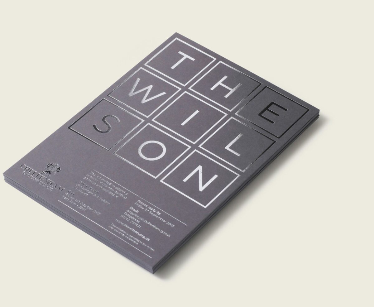
The grid structure of the building’s facade gave us a strong basis on which to construct all the visual elements of the Wilson identity. The rigidity of the square building blocks allow the organisation of 2 and 3D space which helps to liberate the activities, art and artefacts on display.
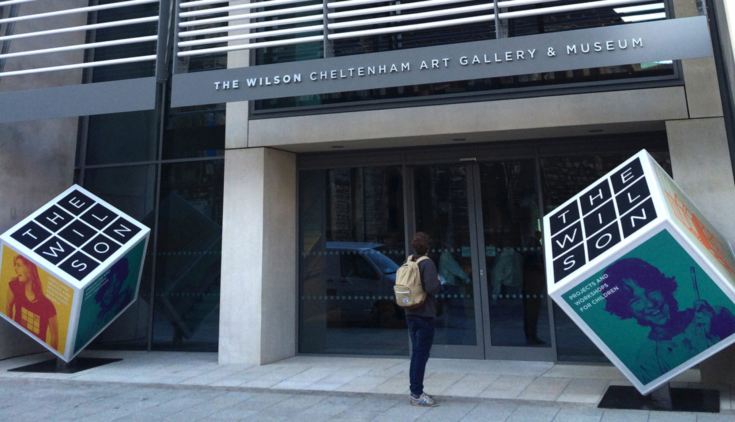
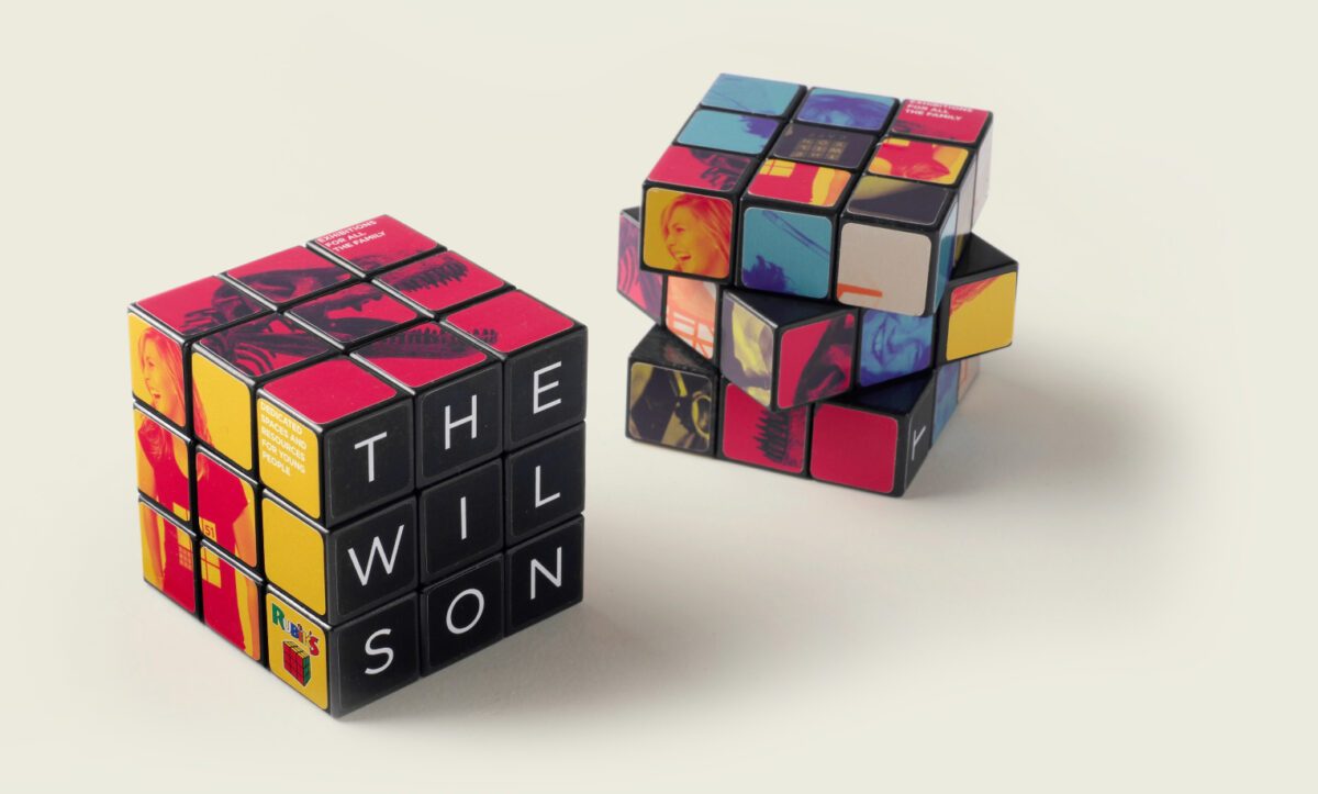
When taken into three dimensions, the system could be applied playfully at large and small scales. Whether as a giveaway or a meeting point, the squares and the cube have become part of an iconography that provides a practical framework for promoting The Wilson’s activities.
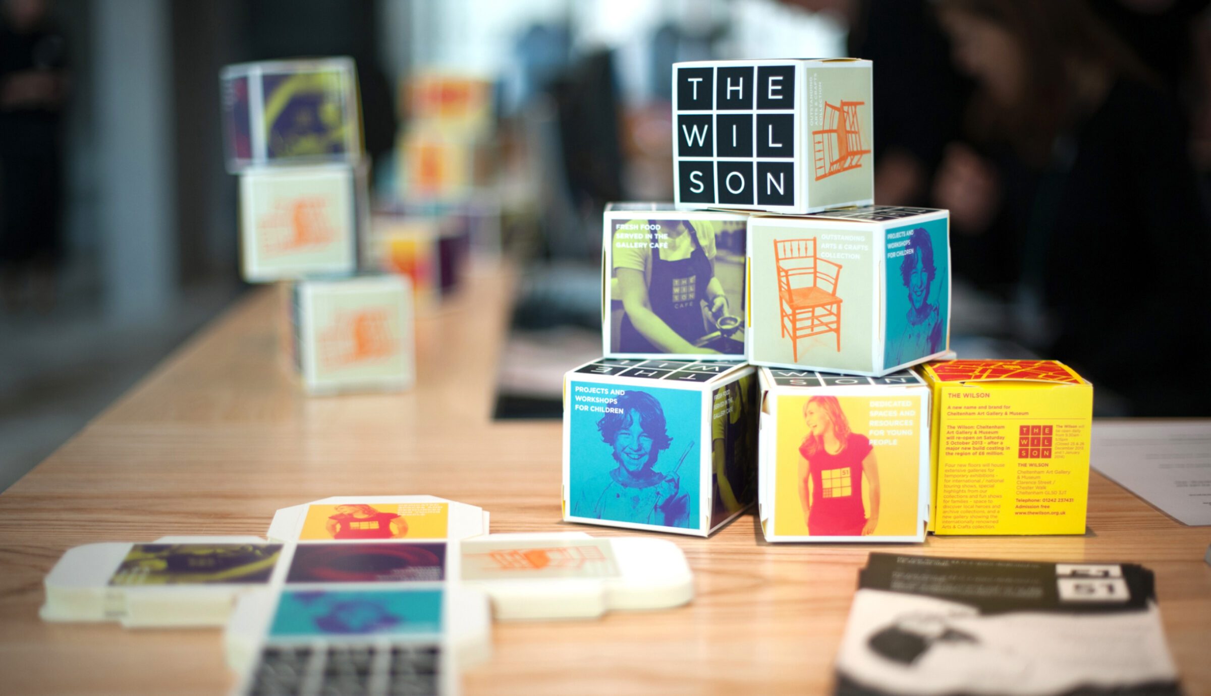
In developing designs for the signage around the building, we realised that the block of six squares translated easily into a directional system. Again, scale played a part and the grid system could be broken down or built up when appropriate.
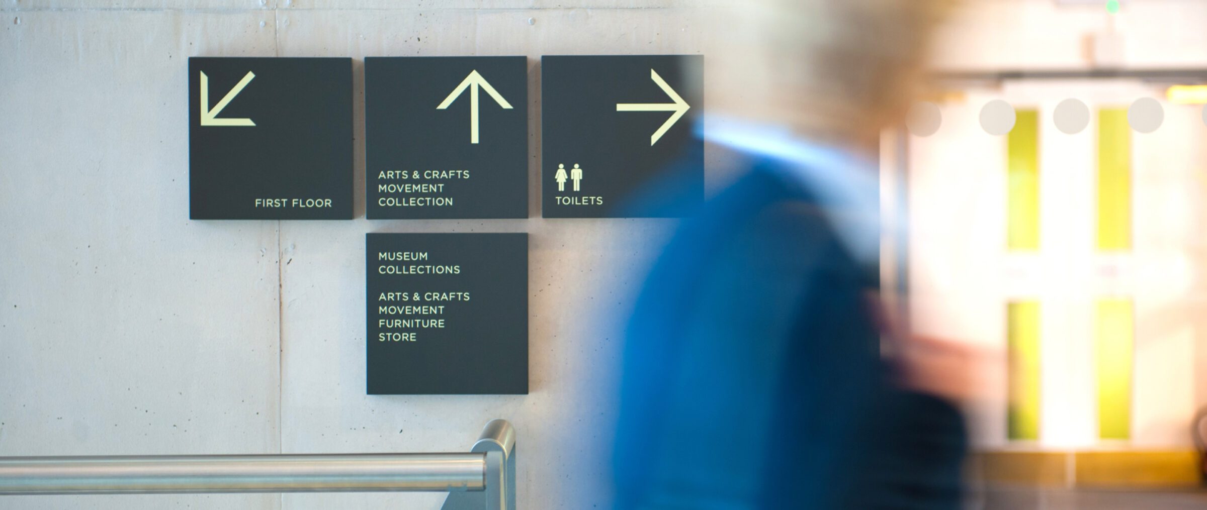
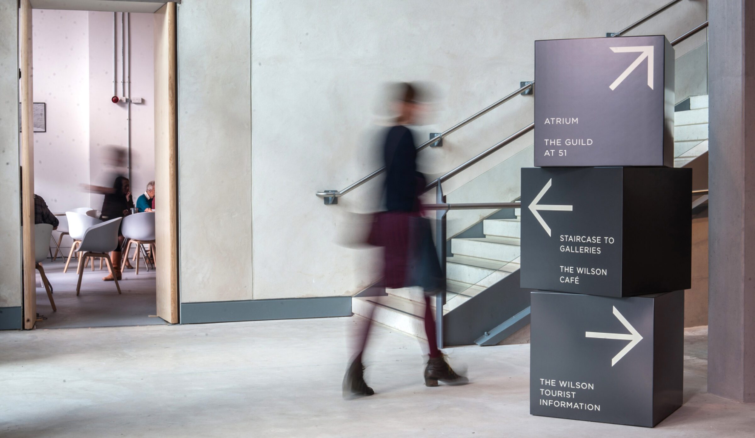
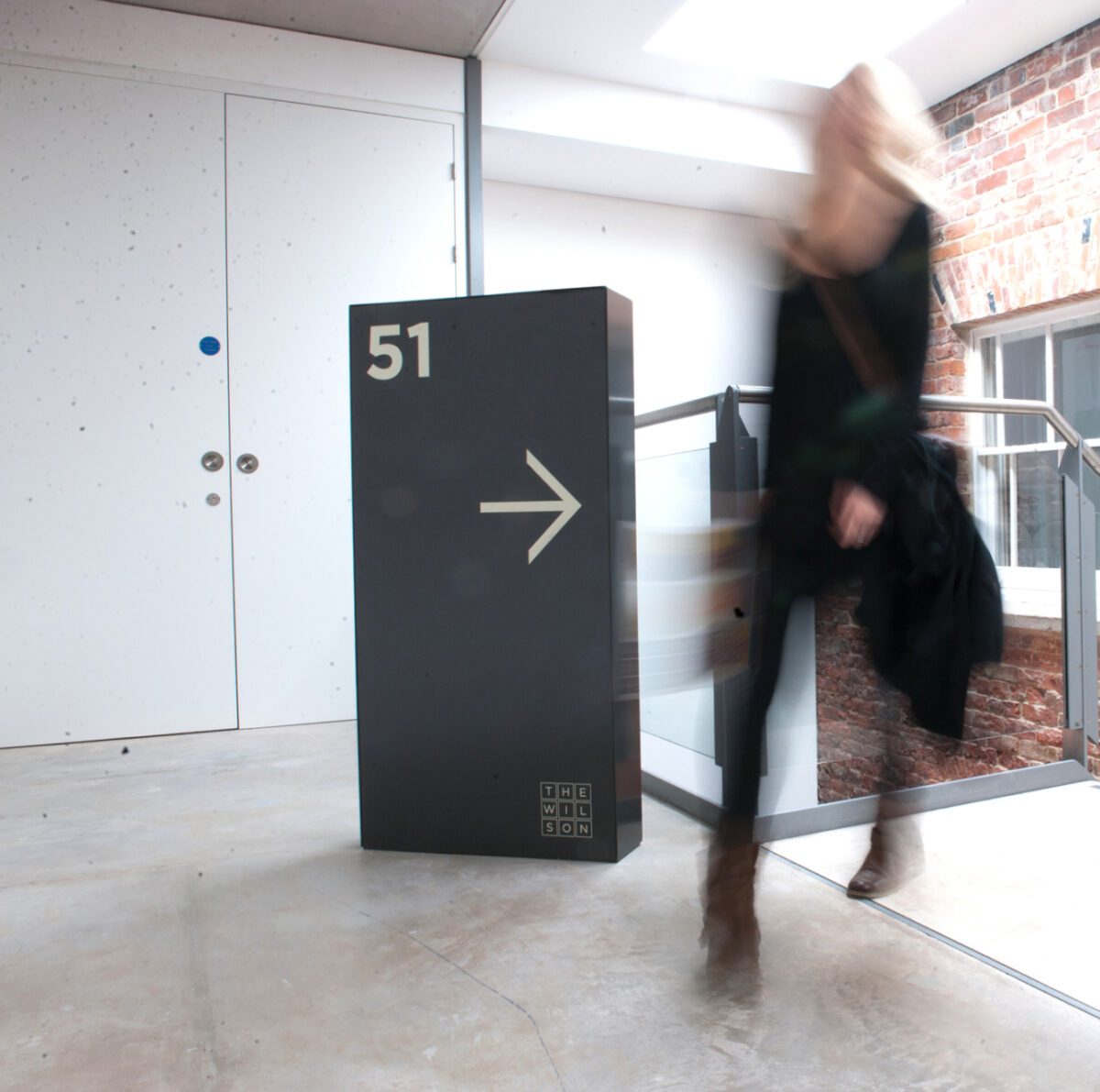
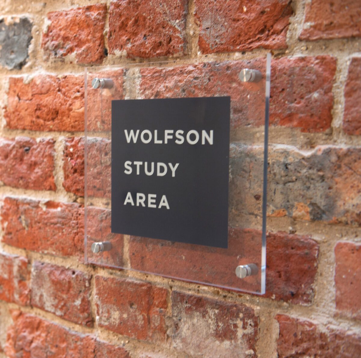
The simple brand architecture allowed other branded activities such as the integrated café and shop, to be clearly labelled within the overarching Wilson identity.

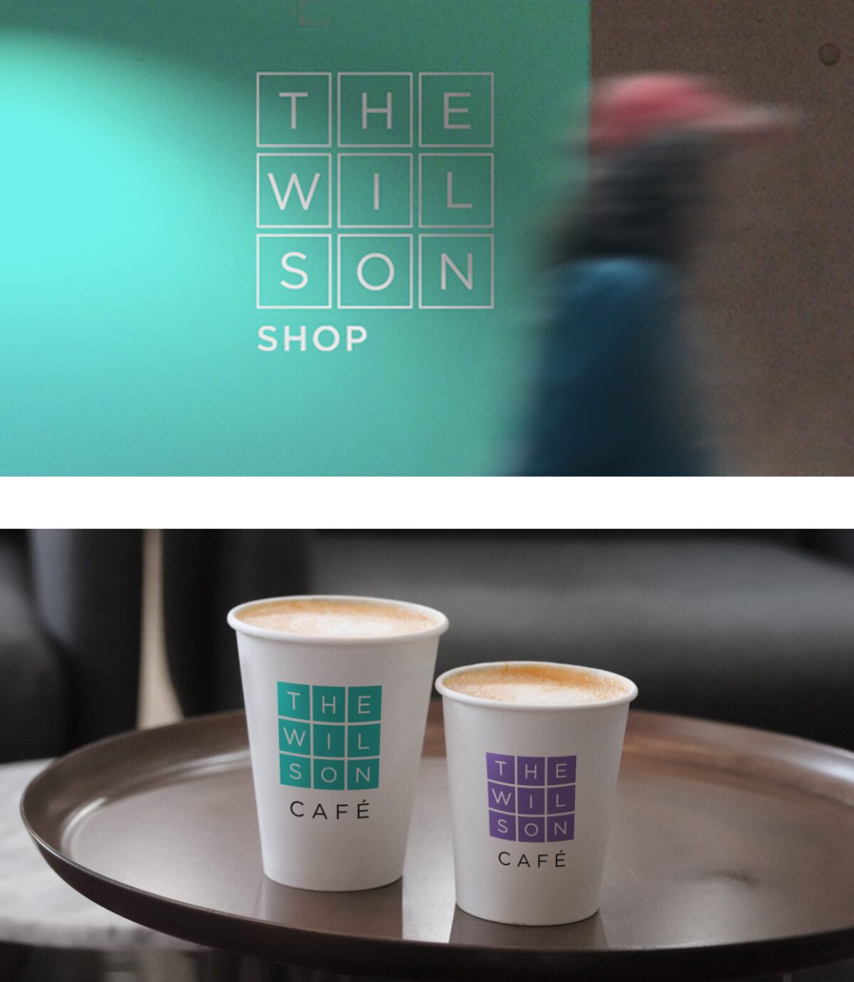
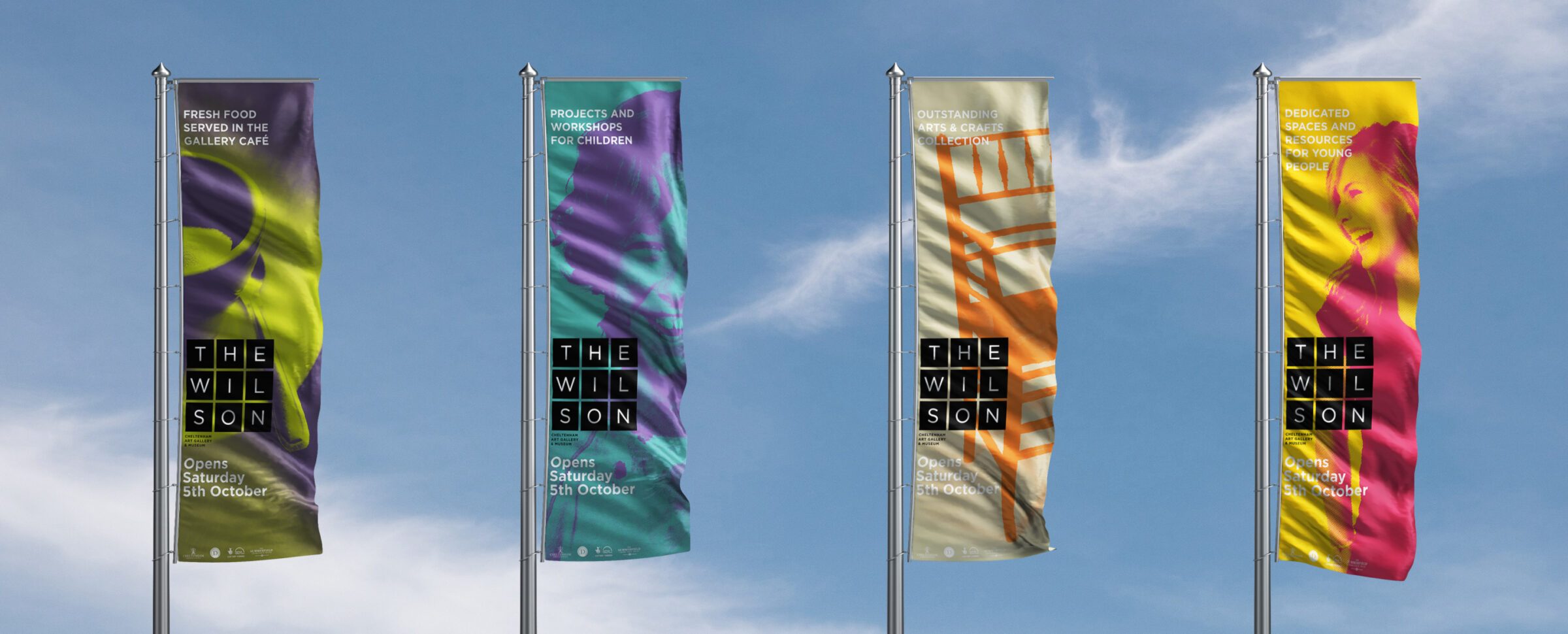
The supporting colour palette helped to give a distinctive look to the imagery that the gallery used. By applying colour in a specific way a sense of ownership and uniqueness could be conveyed across the suite of communications, while visually unifying a diverse set of activities.
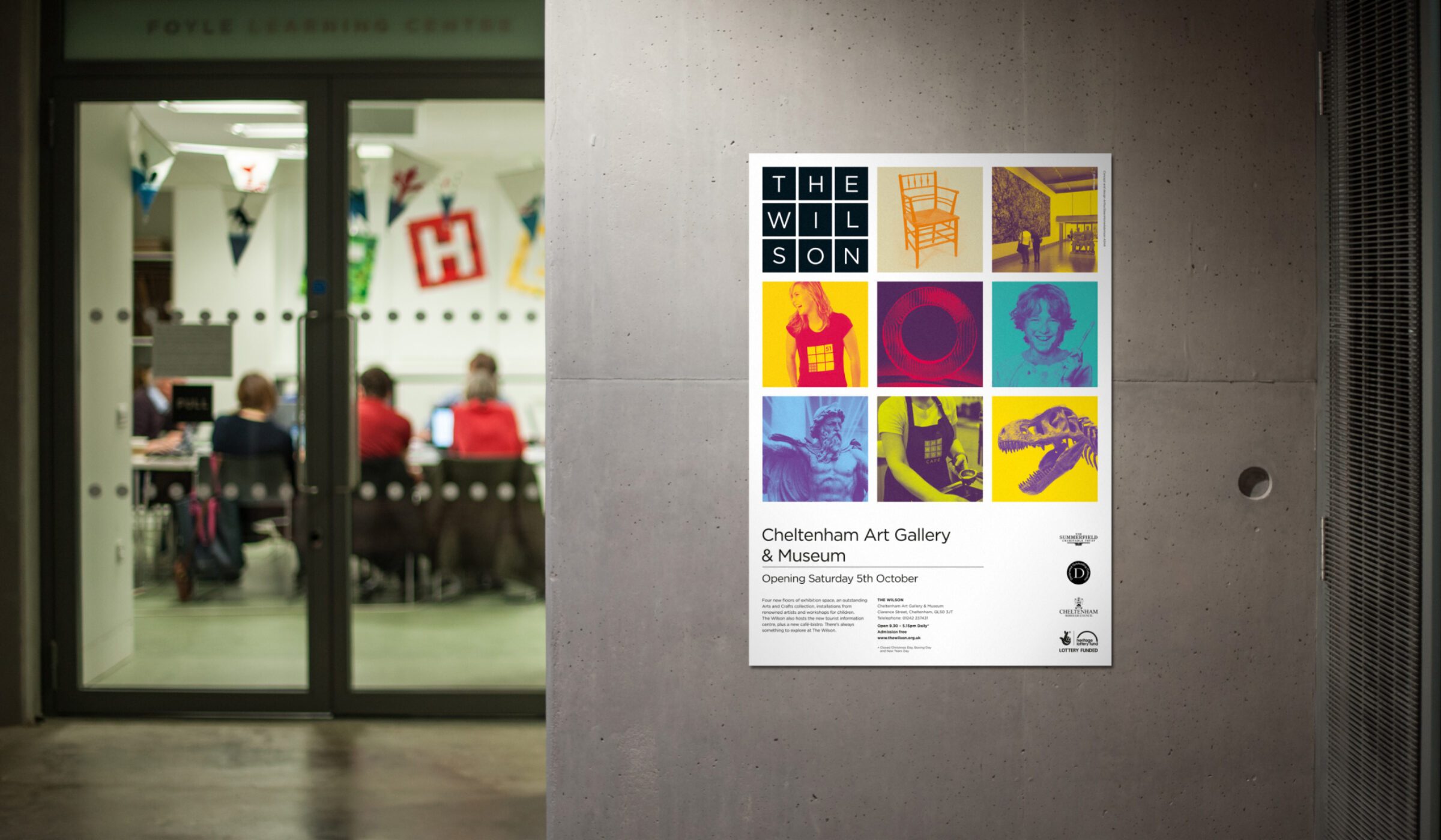
When applied to gallery and museum collateral, the brand needed to be flexible enough to showcase exhibits ranging from Art & Crafts era furniture to contemporary abstract art and children’s creative activities. With the grid system in place, typography and colour were applied to create communications that were varied and engaging, but still held within a clearly branded framework.
In designing the website, we helped create a brand new, online space for the museum & gallery that was in keeping with its physical presence. We ensured that the website reflected the approach of
a contemporary, international destination that was accessible to all.
Have you all been to The Wilson Cheltenham yet? Go have a coffee and take a look around. Feels like a London Gallery in Cheltenham. It’s Great!
@SueSeymour – Twitter
Just been to the preview of our new building Chelt Art Gallery and Museum, now called The Wilson Cheltenham. £6m well spent. Great team effort.
@andynorthchelt – Twitter
