Client
Bible Society
For the first time in a census of England and Wales (2021), less than half of the population (46.2%, 27.5 million people) described themselves as ‘Christian’ – although still the most common religious group. Bible Society wanted to appeal to a younger, broader and increasingly more secular audience. They wanted to show that the Bible has something of value to offer anyone, no matter what their background or belief. As well as refreshing the brand’s key visual assets, we delivered a new positioning and strategy designed to enable the organisation to invite people to discover what the Bible has for them.
Since 1804, Bible Society has been a charity committed to offering the Bible to the world.
By bringing it into public spaces, for instance through the National Parliamentary Prayer Breakfast, or by telling its stories to primary school children through the Open the Book programme, Bible Society helps people discover the Bible for themselves.
It was this sense of shared discovery and invitation that we wanted to embed into the strategy at the heart of the new brand.


In developing the creative elements of the brand, we created a generative idea: ‘An invitation to discover’. This finds its core expression in the new brand mark which contains an open portal or door containing a ‘hidden’ cross. These frameworks gave us the foundations for a flexible design system through which the visual communications are delivered.
We developed the strategic positioning ‘Discovering fresh perspectives’ to communicate the belief that there is something new and different for audiences to find for themselves each time they engage with the Bible.
“We encourage people who've never thought the Bible was for them to explore it for themselves and see life through a different lens.”
Bible Society wanted a way of showing how engaging with the Scriptures could affect people from all walks of life. We created a brief for, and then shot a series of portraits based on the idea of ‘Stories for Life’ . With a focus on broad diversity, these pictures are designed to accompany personal testimonies and illustrate the Bible’s power to change perspectives and alter lives across all parts of society.
Bible Society works all around the world and we wanted to reflect this sense of international mission and reach in the photography they used. With the generative idea of ‘An invitation to discover’ in mind, we curated a series of signature images showing landscapes; each with a sense of a potential journey at its heart.


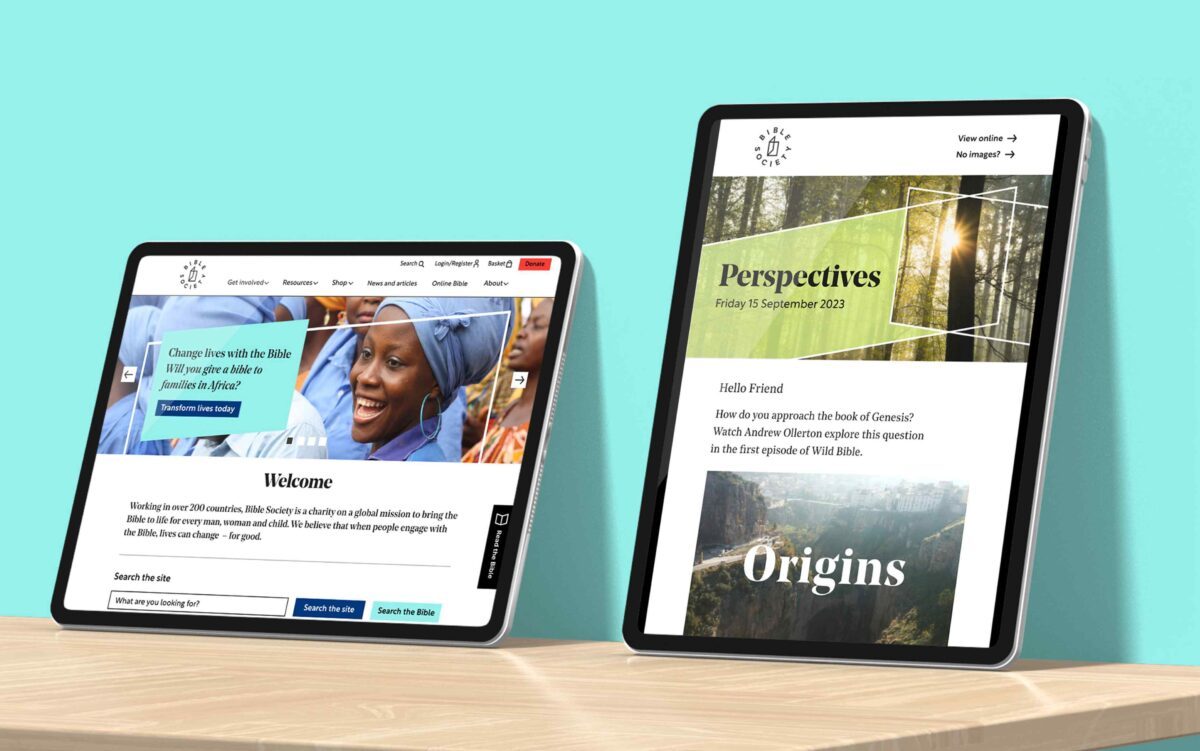
A unique design system uses the framing motifs of the brand mark to present content in fresh and engaging ways. The colour palette is both rich and vibrant and we developed a more invitational tone of voice, coupled with editorial-style typography to create a warmer, less corporate feel.
With a robust new mark, vibrant colour palette, and flexible design system in place, the new suite of brand elements was rigorously tested across a number of communication propositions including direct mail appeals and social media engagement. This enabled us to establish design, layout and tone of voice principles that could be captured in the brand guidelines.


Among a number of flagships designed to showcase the new brand, we reimagined the Bible Society website. The online environment brought the strategic and visual elements together as a cohesive whole, marking a significant step-change in how the organisation presented itself to audiences both old and new.
The brand elements and the new mark are designed to convey an open, forward thinking organisation, inviting people from all backgrounds to explore and encounter the Bible in their own way.

To ensure consistency for roll-out and going forward, we developed detailed and comprehensive guidelines, and worked with the in-house design team for a smooth transition to the new brand.
