Client
Ethus
A newly formed equity fund manager with a refreshingly different approach to investment came to us to create a brand that would communicate a change to the traditional propositions and methodology normally found in the City. We created the name, developed the brand platform and visual identity for Ethus, the investors who see reward in prosperity, rather than pure profit.
The foundation of Ethus’ approach to their investment strategy was the way they sought not only to benefit their shareholders and investors, but that a portion of any profit made from financial trading would be put back into projects that benfitted society as a whole. We expressed this outcome as ‘Positive Capital’.
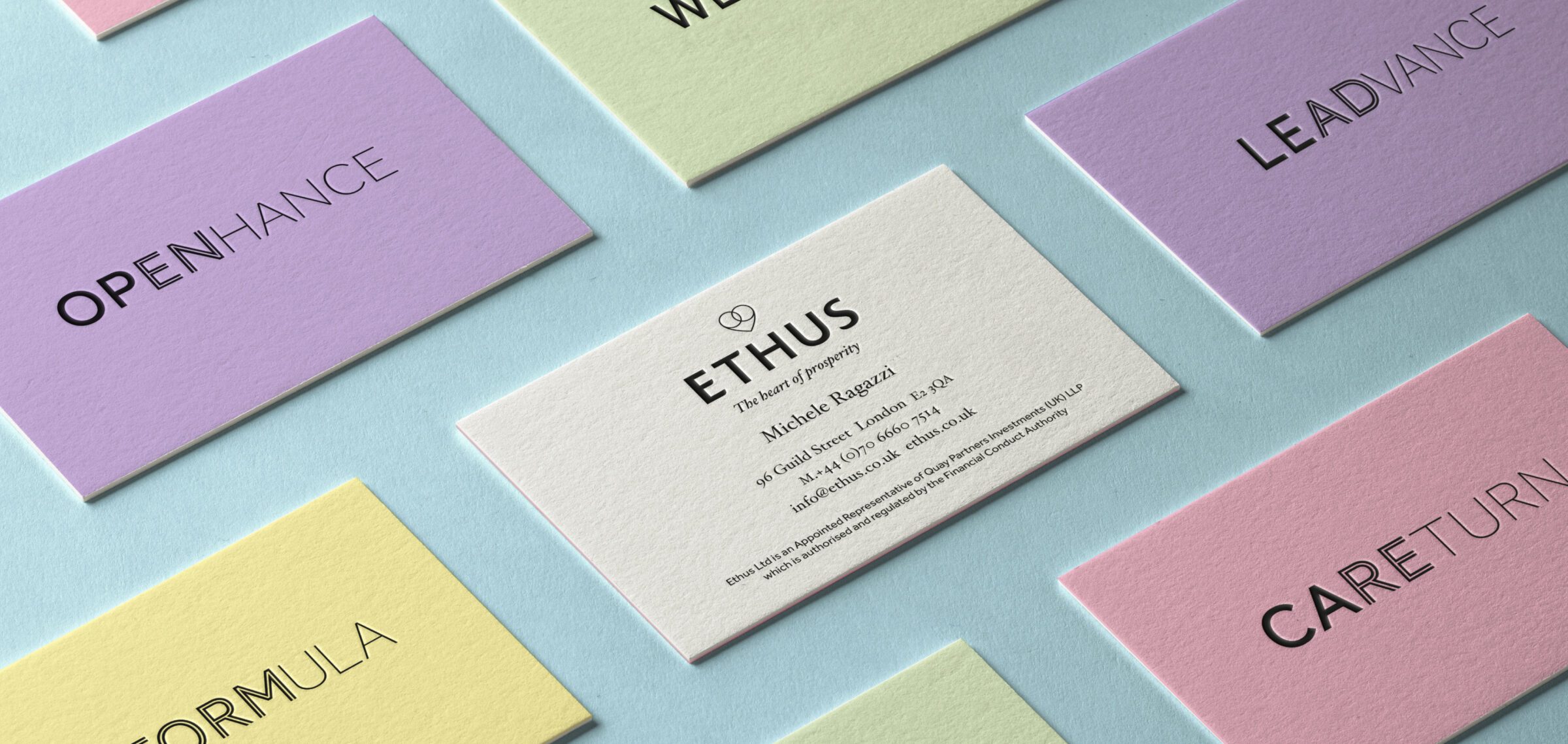
The Ethus approach led us to create the driving idea – ‘the heart of prosperity’ which could help the brand express the way they do things in a way that creates benefit as well as profit. In bringing this behaviour to life we created a distinctive tone of voice that used crafted typography to overlap words to give significant new meaning.
In order for Ethus to deliver their vision, we helped them distil their approach into four key behaviours: Complete Transparency, Collaborative Thinking, Improving the Formula and Giving Back to Society. These were translated into a set of symbols which gave us a unique visual language with which to create the brand identity for the organisation.


We encapsulated the Ethus philosophy in a brand book that would convey the values and personality of the brand. The little handbook explained the Ethus approach and expressed it using our typographic word combinations with a distinctive colour palette and patterns inspired by international banknotes.
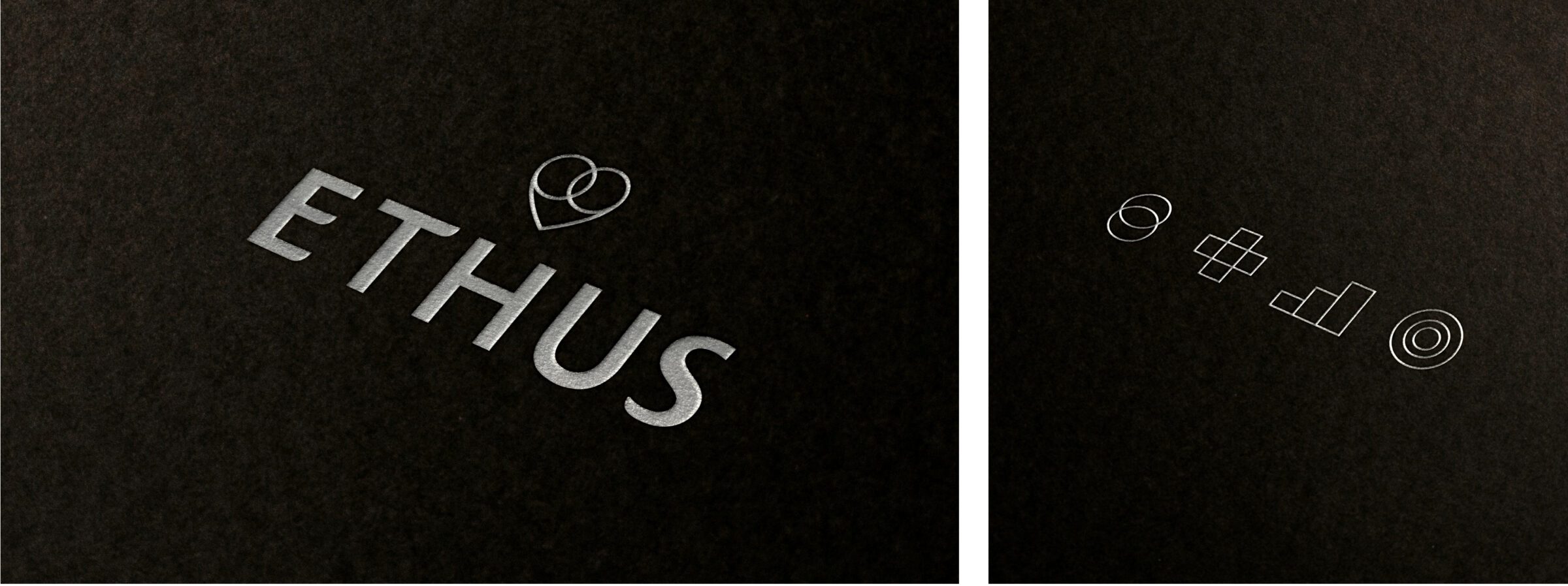


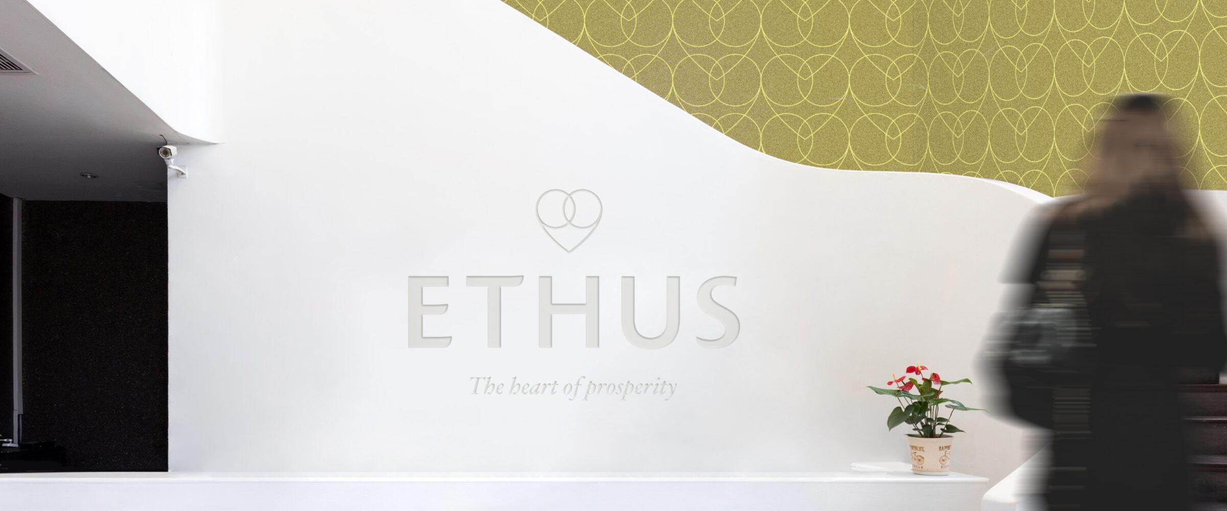
The logotype is a uniquely crafted mark that features the heart of prosperity symbol. Designed to give an impression of stature, stability and value whilst making a focal point of the company’s humanitarian outlook.
Key touchpoints provided opportunities to convey Ethus’ unique tone of voice while in the production of printed items; foil blocking, duplexing and uncoated paper stocks brought a sense of value to company collateral.

The visual identity has been designed to work across print, online and in office environments. The symbols that have been created for the four pillars can be used to create patterns for wall vinyls as well as endpapers and to add texture to online backgrounds. The ‘heart of prosperity’ symbol pin badge is for those who wish to show their support of Ethus’ values.
At Ethus, we believe that we have a unique investment approach. ASHA & Co gave us the means to express who we are and what we do and brought this to life in the brand they created for us. They drill to the core and bring real, lasting value to the surface.
Christian Elliot, Chief Marketing Officer


The Fund Fact Sheet gives updates on investments as well as giving expert guidance and insight into the likely performance of markets in the coming months. Using the newly developed colour palette and patterns, we created a style for infographics, including financial charts and graphs. We developed a template that could take information from Ethus’ data systems and flow it into a branded, formatted document for distribution.