Client
South East Regional Care Cooperative

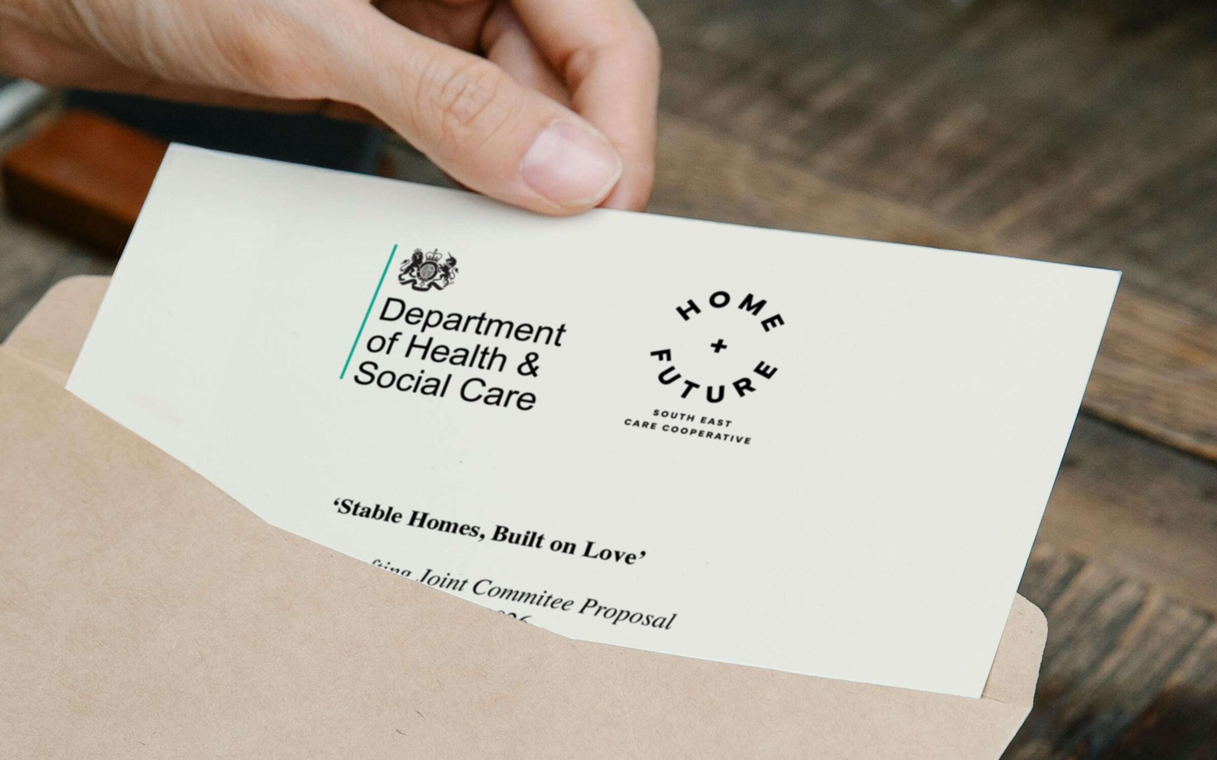
Working within a fragmented and siloed care system, with a backdrop of rising costs and budgetary overspend, The South East Regional Care Cooperative (SE RCC) faced many challenges. They wanted to articulate their far-reaching ambitions to reform the care system into a model of collaboration and efficiency. Communicating their objective of improving outcomes for children and young people was central to the brief.

Our approach

In creating Home and Future we gave the cooperative not just a name, but a clear role: to unite local authorities around a shared standard for care. The brand mark combines dynamic typography with a plus symbol, representing connection, positive outcomes, and the power of working together.

The strategy

Our core creative idea, ‘Foundations for Life,’ captures Home and Future’s ambition. It speaks to the brand’s dual responsibility: providing children with safe, loving homes today, while enhancing the systems and structures that secure better futures. This idea drives how Home and Future operates, presents itself, and partners with others.

HF 03 TOTE min
HF 04 BADGE min
HF 05 INVITE min

Crucially, the rebrand positions the cooperative as more than an administrative mechanism. It becomes a benchmark – a trusted mark of quality, like B Corp or the Rainforest Alliance.

The brand mark is simple and robust to communicate authority, yet dynamic enough to express optimism and playfulness. A special ‘boilerplate’ graphic which combines the mark with a simple description of their approach sets the standard for potential partners.

HF 06 BOILERPLATE min

The design system is bold, flexible, and designed to express positivity. Built from simple geometric forms – semi-circles, arches, and the central plus – it can be combined in playful ways to create rainbows, smiles, and sunrises. These motifs capture the spirit of playfulness, exploration, and growth, balancing the brand’s authority with warmth and humanity.

A vibrant colour palette gives scope for creative expression, while photography shows real children and young people in safe, happy environments. The imagery is authentic and diverse, celebrating everyday life and representing children of all ages, races, genders, and abilities.

The result is a brand that is both authoritative and uplifting. It has the trust and stability of a standard while remaining flexible enough to tell human stories with warmth and optimism.

HF 11 CONFERENCE min
HF 12 BANNERS min
HF 13 BUNTING min

The impact

With a new identity and positioning that sets them apart from any other organisation in the sector, Home and Future can demonstrate to local authorities and partners that they are setting a new benchmark for quality, efficiency and value for money. Ultimately and most importantly, this will ensure that children and young people needing help are seen, heard and fully supported.