Client
Marketing Cheltenham
With beautiful countryside, award winning schools, great transport infrastructure, and being the UK's hub for the cyber-tech industry; Cheltenham is considered one of the best places to live and work in the UK (Sunday Times Survey 2020). Working with Cheltenham Borough Council, Marketing Cheltenham needed a campaign to show the breadth of benefits and opportunity the town has to offer.
Famous for the Gold Cup, the Ladies College, and as an upwardly mobile spa town, Cheltenham also has many other, less well-known attributes. The brief for the campaign was to communicate the town’s benefits to a wider audience of SMEs, skilled workers and young families, looking for an alternative to big city living.
We needed to establish the town as a credible destination for business,
and that it had a strong infrastructure to support the demands of a skilled workforce and their families.
Following the first COVID lockdown, remote working had become more commonplace. In creating the campaign 'We're Moving to Cheltenham',
we harnessed the sense that people now had more flexibility when choosing a location to live, and were no longer tied to the larger cities. Rather than settle for the usual 'it's great here - why not give us a try?' type strap-line used by so many provincial towns, we wanted to create a feeling of confidence and natural momentum.
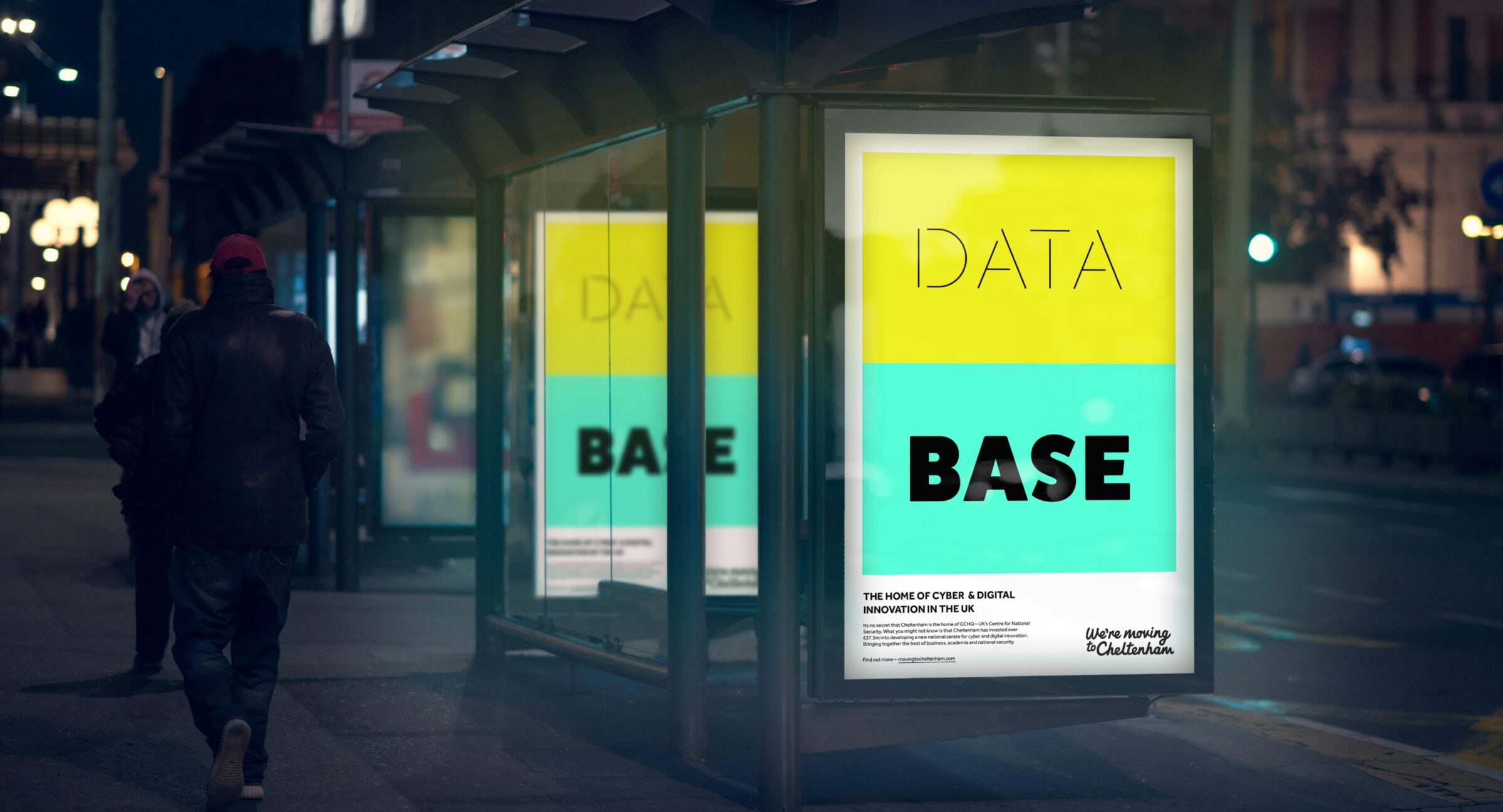
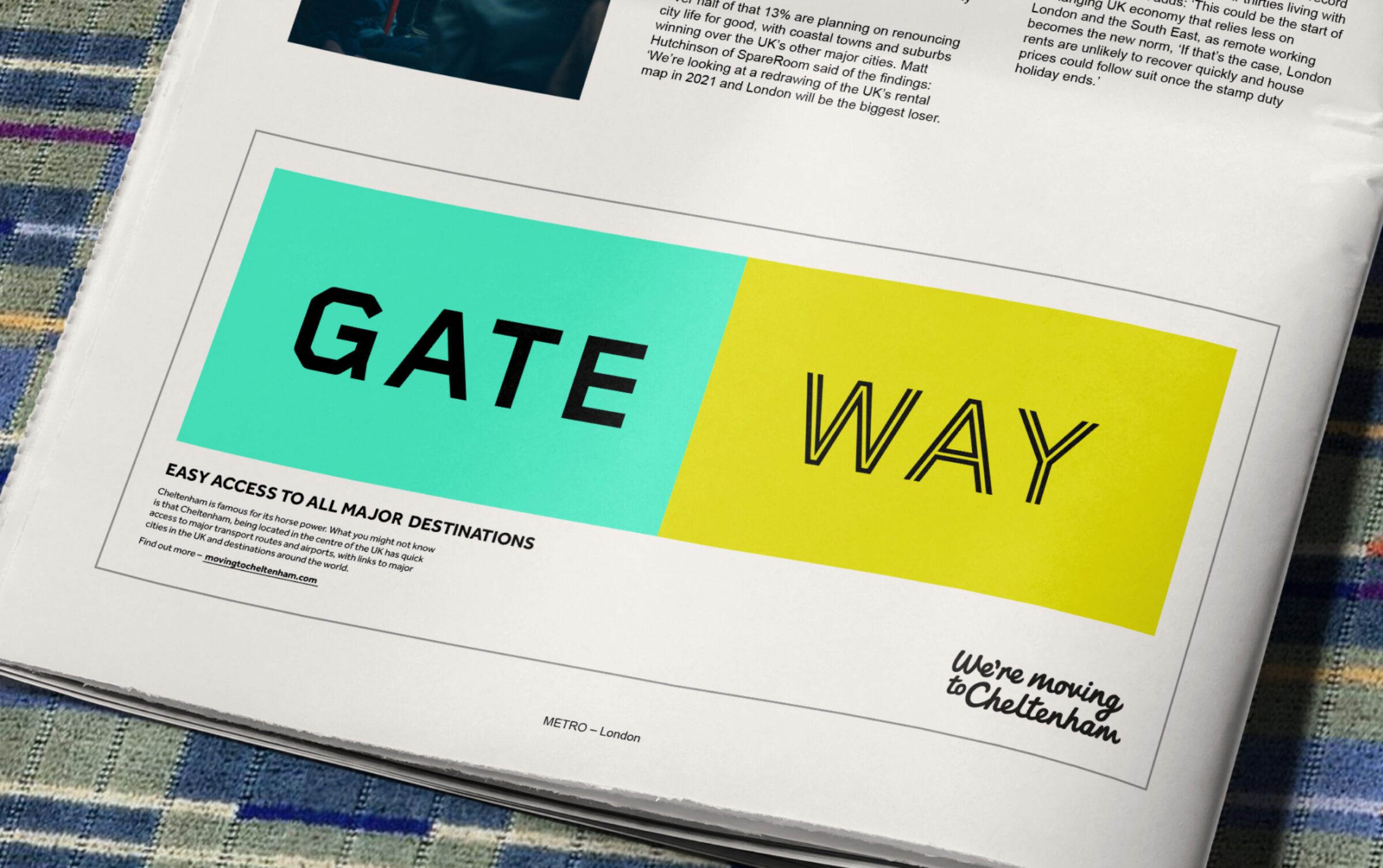
The visual framework of the campaign is based on the idea of compound words – made up of two smaller words, used to illustrate the multi-faceted nature of the town’s many appealing features. The two halves of each word conveyed a separate benefit, while the overall picture was one of a dynamic environment, full of opportunity and appeal.
The design of the campaign makes bold use of colour and type to show variety and depth. Differing font styles and bright, contrasting colours are deliberately pushed together to give an eclectic feel – the sense of something for everyone.


Supporting copy gave the detail, leading with a well known Cheltenham fact which was supported by more up-to-date, less obvious information that would be of interest to target audiences.
The short film we produced brings the visual elements of the campaign together. The bright colours and bold typography are cut with footage of the activities and sights in and around the town. Lively and fast-paced, the film conveys the excitement of the various festivals, while a montage of the town’s education, shopping, nightlife, transport and local environment show how much bang you get for your buck in the Cotswolds.
The bright, punchy colours and snappy animation we developed was designed to work well in an online environment, with ads for web and social media. We also took the campaign into print and outdoor applications.

To build on the campaign’s momentum, we developed a suite of branded merch that would help create the sense of a ‘movement’ already underway. The items are designed to be seen around the streets and office environments of other towns and cities, provoking lighthearted intrigue and a sense of others ‘in the know’.


Having created the campaign, we applied the visual identity to a website which would be a hub of helpful information. Here, you can find out about Government investment, how to move a business, careers, education and property for sale in the area.