Client
Nominet

Nominet is well-established as the guardian of the UK’s national domain space, managing all .co.uk and .uk domain names. Its role is fundamental, providing the digital infrastructure that underpins millions of websites, public services, and businesses. The brand needed to resonate beyond the technical, expressing its role as a catalyst for a safer, more inclusive digital future.

The challenge

Recent changes to the organisation, a new direction, 
and a wish to rebuild relationships with members and stakeholders had brought Nominet to an important turning point. They needed a confident, ownable identity that captured the organisation’s unique dual role as a provider of critical digital infrastructure and as a force for societal good.

Our approach

We focused on what Nominet is really about: being the ‘guardians of your domain’. This means two things – working expertly behind the scenes to keep the digital economy running smoothly, and as a public facing charity that promotes progress and inclusion.

NOM REPORTS min

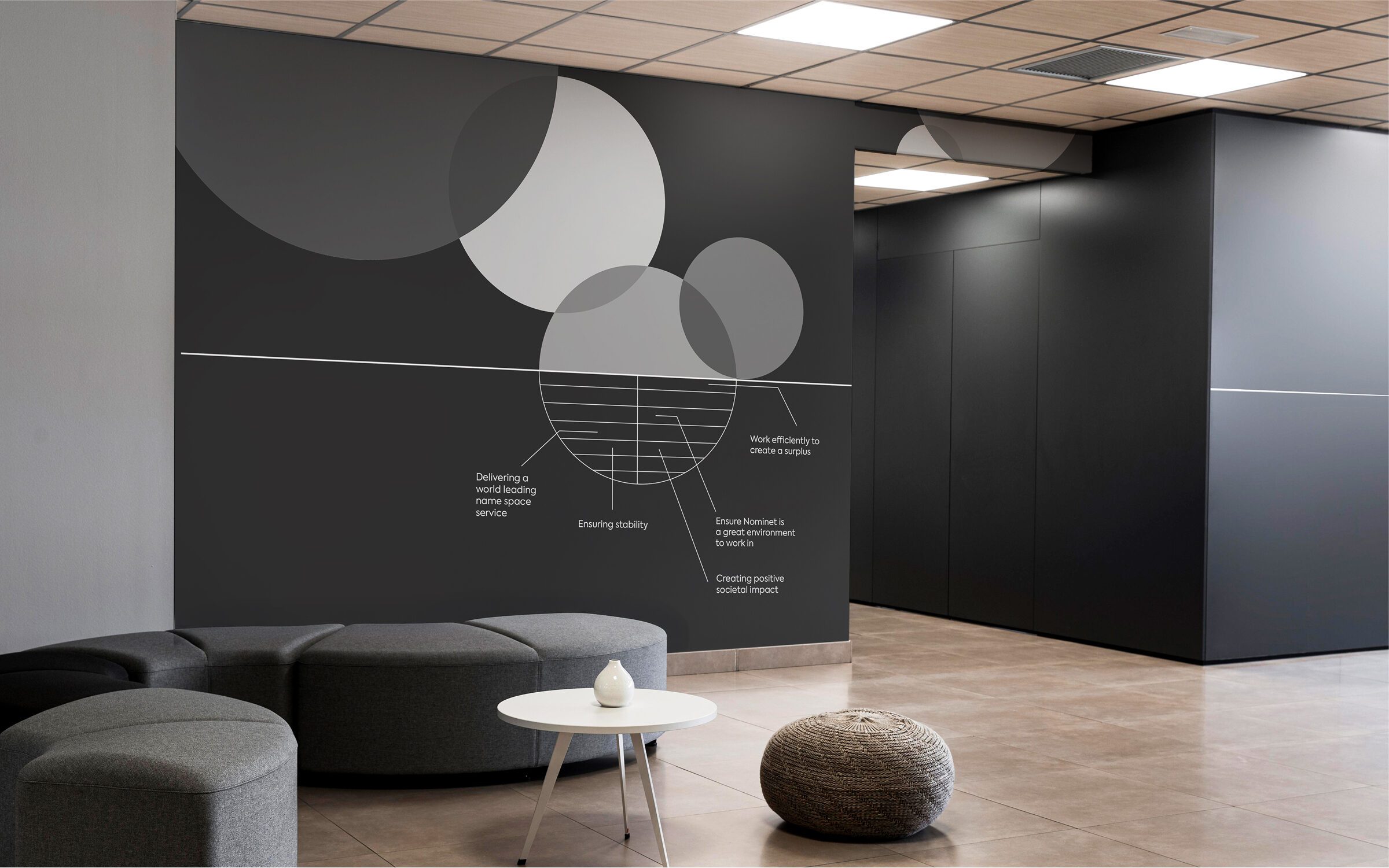
The design system is split by a line into two layers. The layer below represents Nominet’s unseen, technical capability and network. This layer visualises the stability and trust that underpin the digital economy, invisible, yet essential foundations that support the UK domain space. The layer above is where the brand comes alive. Expressive shapes, vibrant colours, and dynamic compositions celebrate the human and societal impact of Nominet’s work.

This duality; the quiet competence below, the confident voice above, reflects Nominet’s role as both an enabler of digital infrastructure and a driver of societal progress. 
The design system is flexible and ownable, balancing clarity with expressiveness, and ensuring consistency across all touchpoints, from member communications to public campaigns.

NOM SYSTEM CIRCLES GREEN
NOM SYSTEM SQUARES

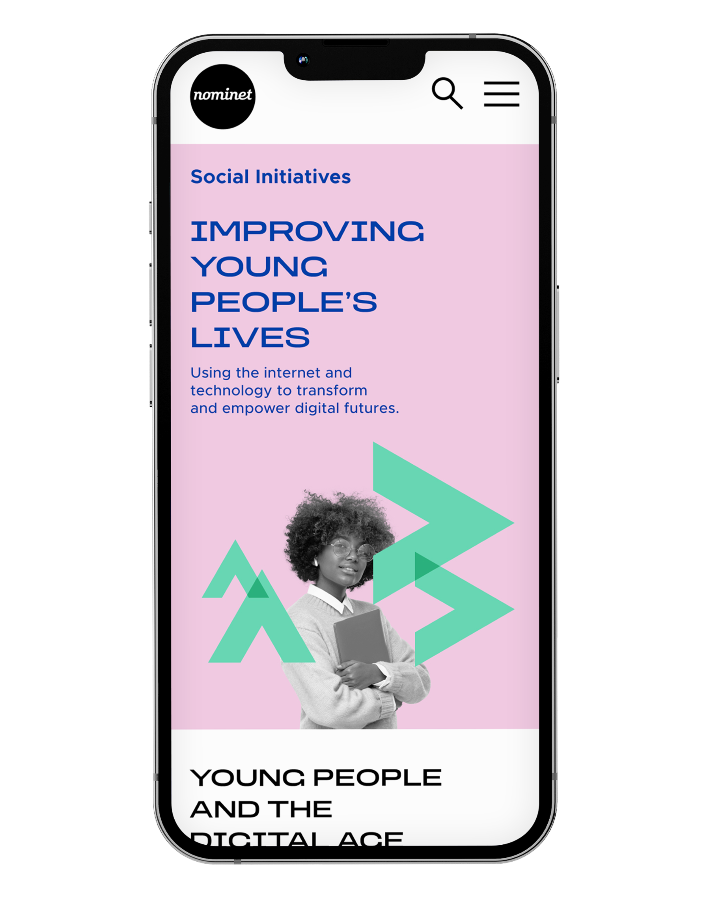
By incorporating photography, the design system can be flexed to be more precise and highlight specific points of interest. The simple, geometric shapes can also be playfully applied to cut-out, black and white imagery.

NOM REPORT 01 min
NOM REPORT 02 min

The colour palette is a modern twist on the classic Bauhaus style. As Nominet works mostly online, we took a ‘web-first’ approach, developing a range of colours to help the brand adapt across different platforms.

IMAGERY 01 min
IMAGERY 02 min
NOM LADY JUSTCIE min
NOMINET i Phone YELLOW 2
NOMINET i Phone SOCIAL PINK 2

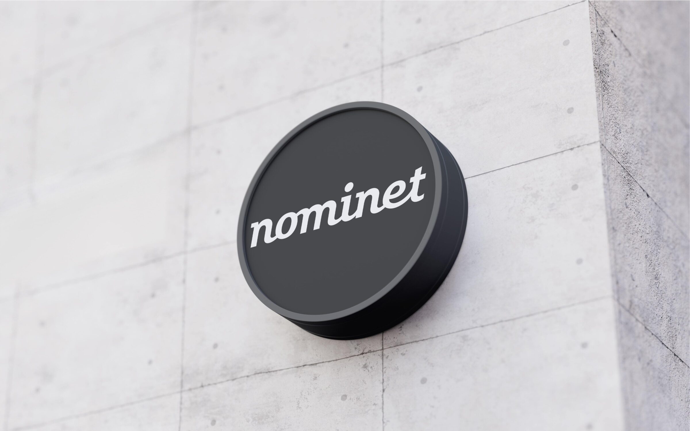
The brand mark is a signature that reflects the connected nature of everything Nominet does. The dot symbolises the dot in domain names, like dot-uk, representing global reach and acting as a full stop that neatly signs off the communications.

Nominet sign min
WALL GRAPHIC 1

With the creative idea of ‘Net Positive’ at its core, Nominet’s communications now express not just what it does, but why it matters. This clarity has reconnected the brand with its members, stakeholders, and the broader public, reaffirming Nominet’s place at the heart of the UK’s digital future.