Client
Westminster Drug Project
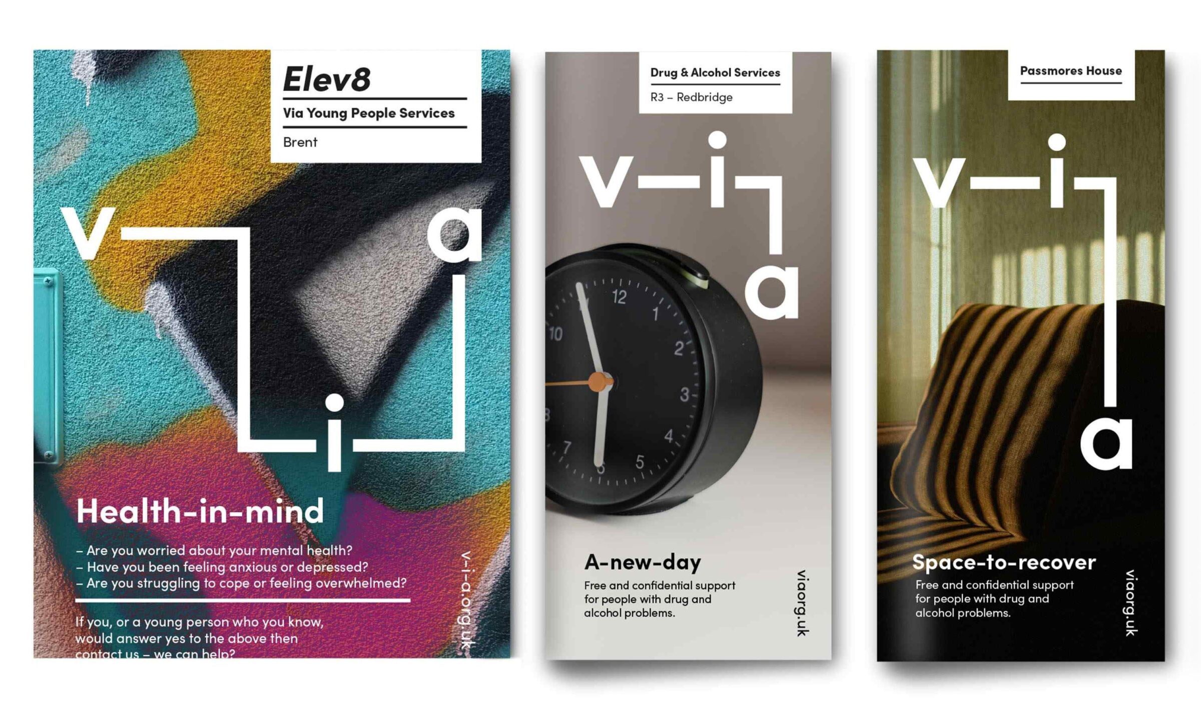
Providing a host of recovery, health and wellbeing services for adults and young people, Via (formerly known as Westminster Drug Project) was expanding its services across the UK. The old name was confusing and no longer appropriate as their geographical reach was widening, and the new brand would need to be strategically repositioned to communicate the breadth of services to commissioners, service users and the wider public.
Building strong foundations
Following a thorough diagnostic stage, we shaped a new strategic framework that defined the function, aspirations and positioning of the organisation and established a key driving idea: ‘Well-connected’ which would inform how the organisation would approach all its future activities.
En route to recovery
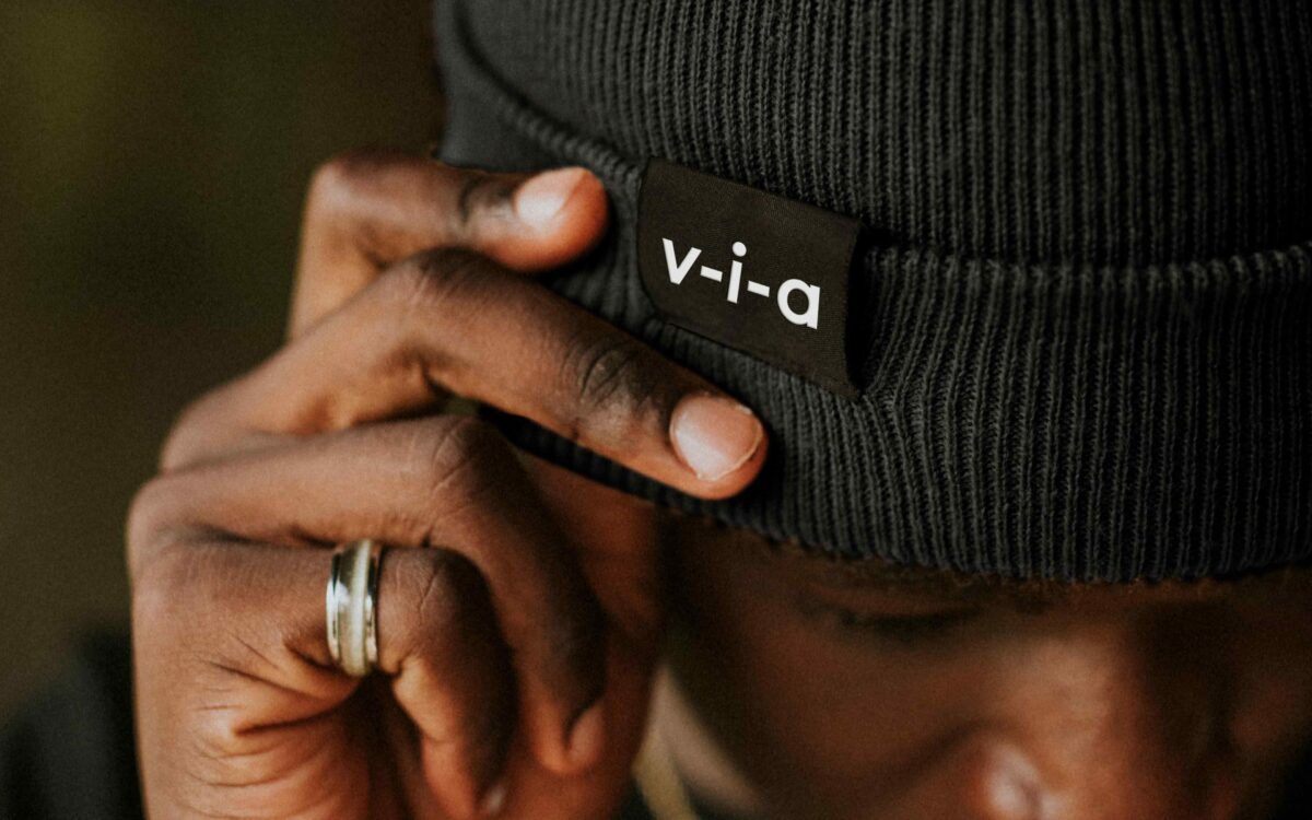
We created a new name for the brand – Via. The name is intended to show that the service is not an end in itself, but part of a journey on a route to transformation. One of the key shifts in perception that Via wanted to achieve among its service users was the idea of ‘being with’ them on their journey rather than telling them what they need to do.
A unique journey
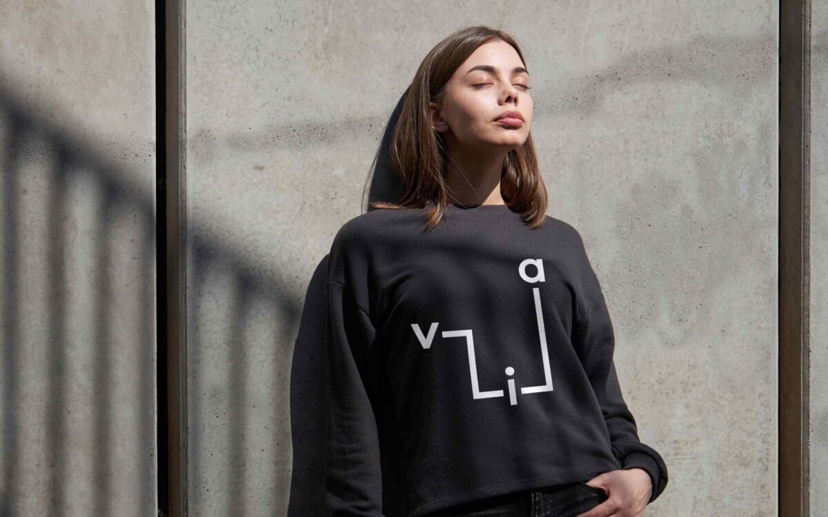
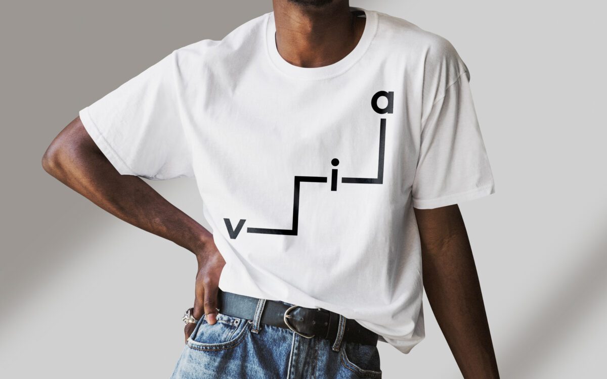
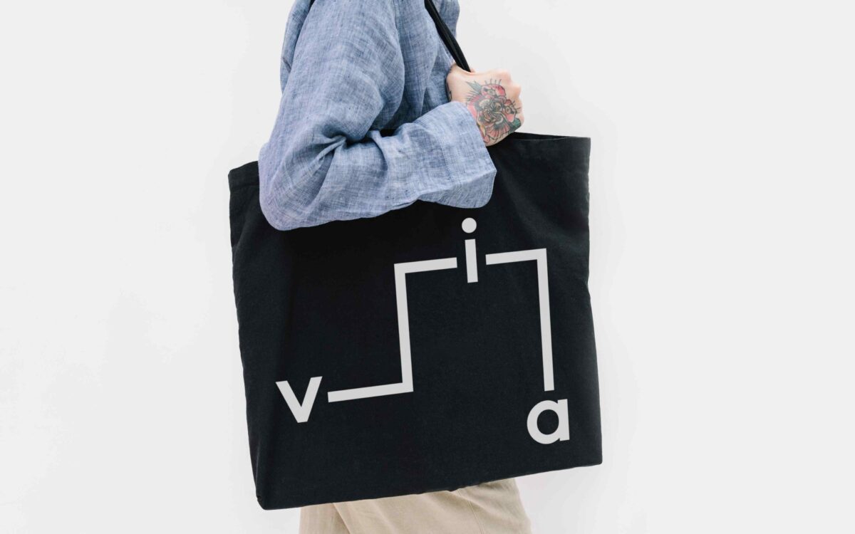
Using our driving idea of ‘Well-connected’, we explored the concept of individual journeys to develop an ever-changing, flexible brand mark that could express the sense of each service user’s unique path towards wellness.
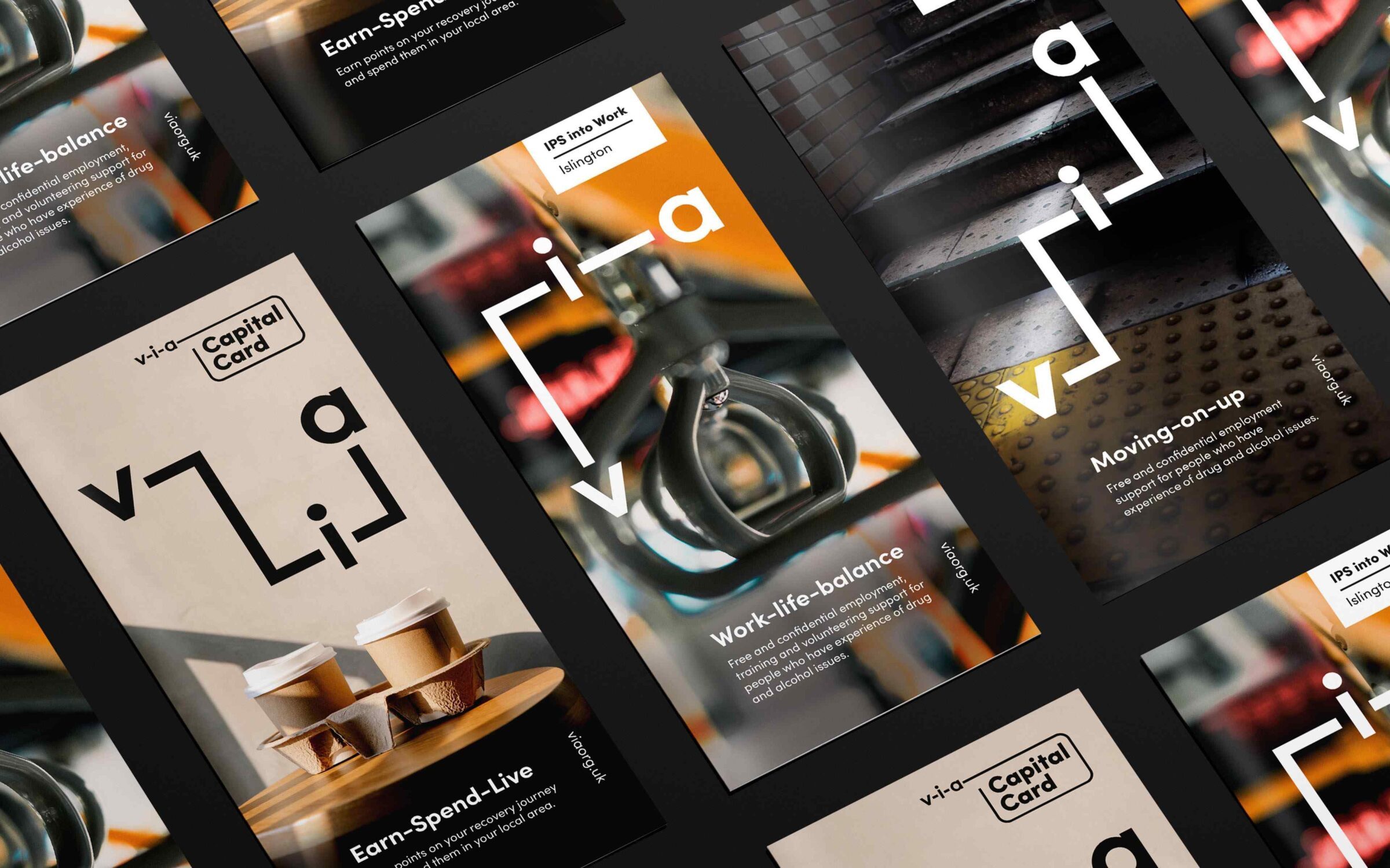
The Via brand mark symbolises these journeys – always on the move, it suggests the step-by-step approach that Via uses. Deliberately crafted for consistency, the new mark is both instantly recognisable and endlessly flexible.

Words of encouragement
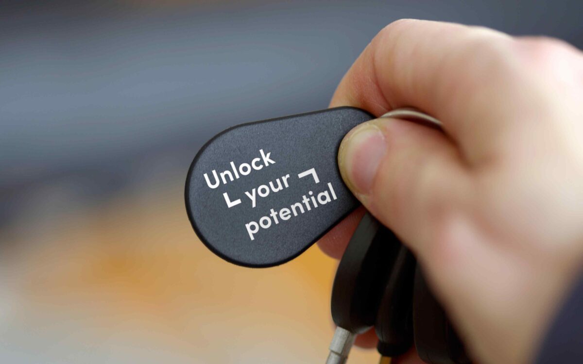
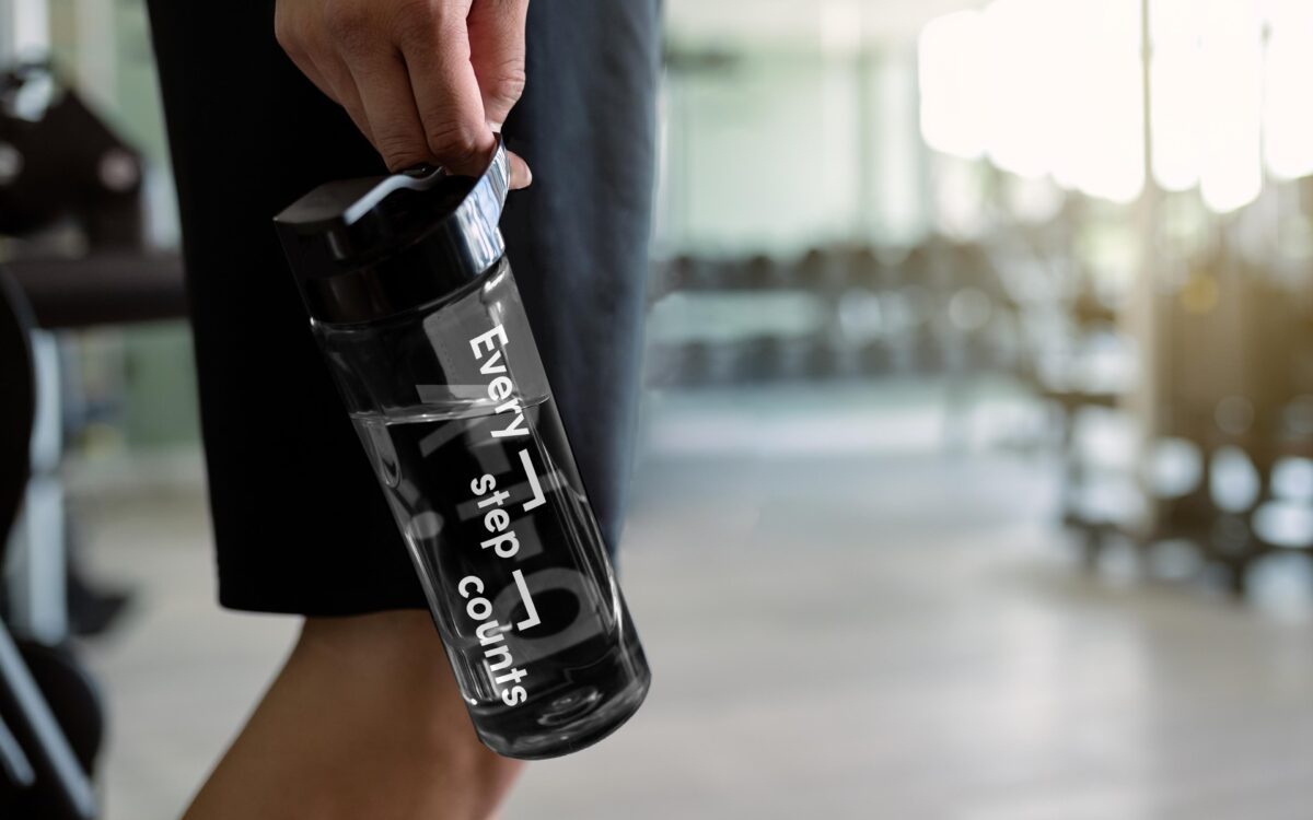
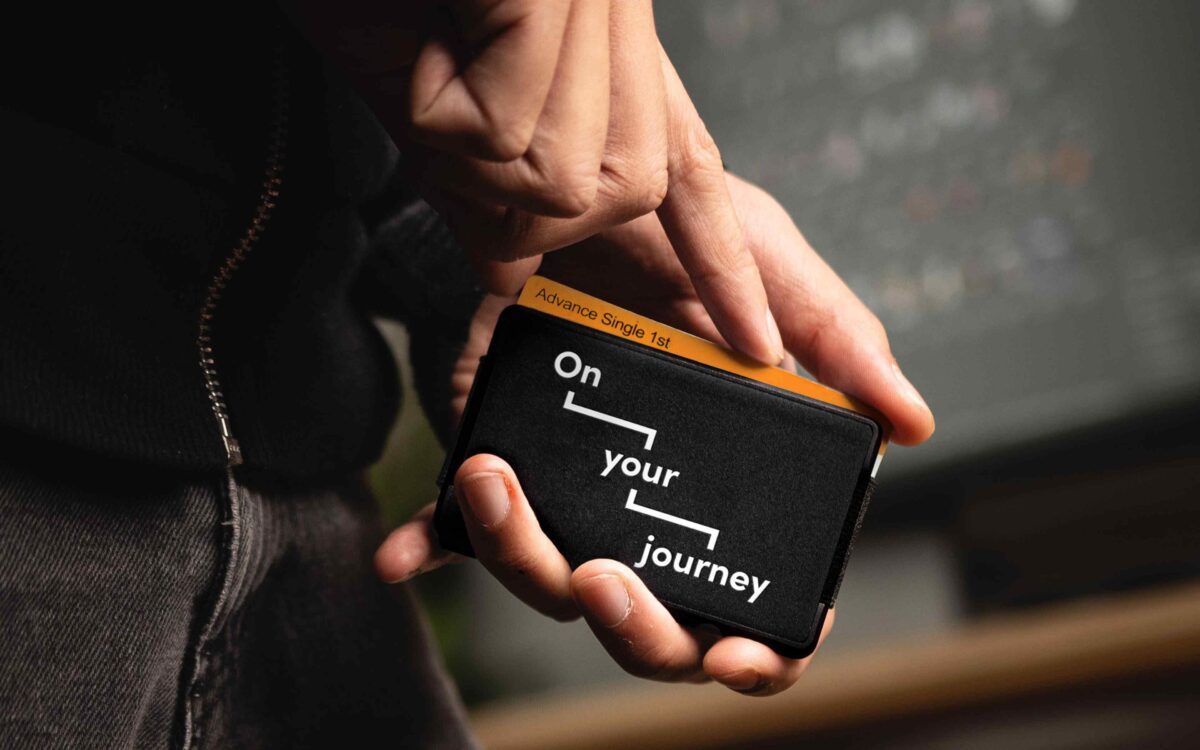
We developed a tone of voice to reflect the idea of journeys using three-word combinations for headlines. These are positive phrases tailored to reflect the challenges and opportunities that users would come across on their roads to recovery. The headlines maintain the same flexibility seen in the brand mark.
People have totally understood the concept of the journey, the use of photography to reflect beauty in the everyday, and the name itself reinforces one of the most important points – we’re part of a journey, not the end. I think that’s why there’s been such a strong reaction to it.
Anna Whitton – CEO, Via
Fit for purpose
All Via communications have been designed to be clear and simple. The typography, combined with a deliberately restricted use of black and white is designed to give an accessible, robust, ‘no-nonsense’ feel to text and layouts.
A world of colour
Colour is injected into the brand through our hero ‘Beauty in the everyday’ imagery. These pictures capture simple moments of ordinary life; for example a sunny morning or ironing a shirt for work. These can represent aspiration and significant achievement for many service users as they journey towards recovery – not a perfect world, but a real one.
A new angle on information
We developed a suite of distinctive icons to illustrate some key themes and activities. Designed to support service users that may struggle with literacy or language barriers, they use a simple, angular style and appear in black or white.
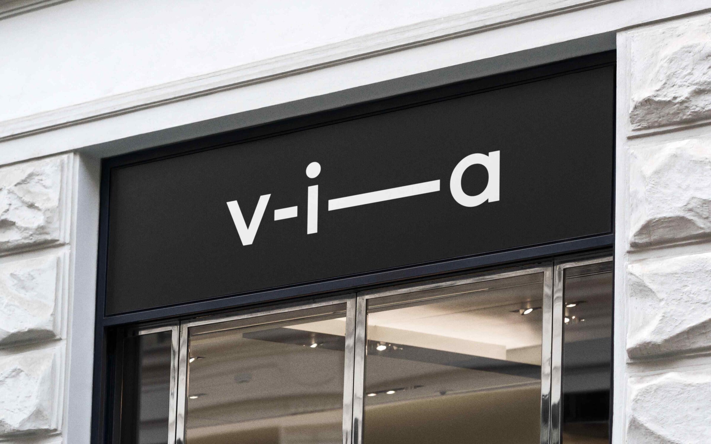
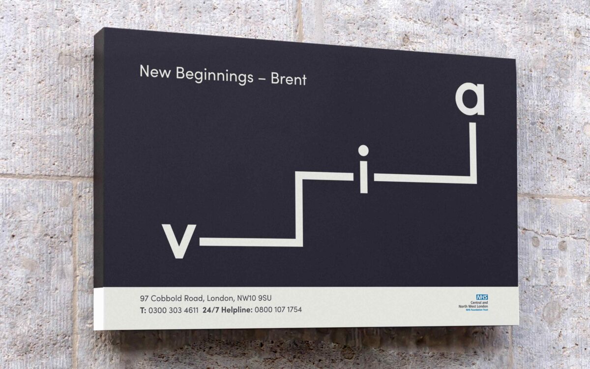
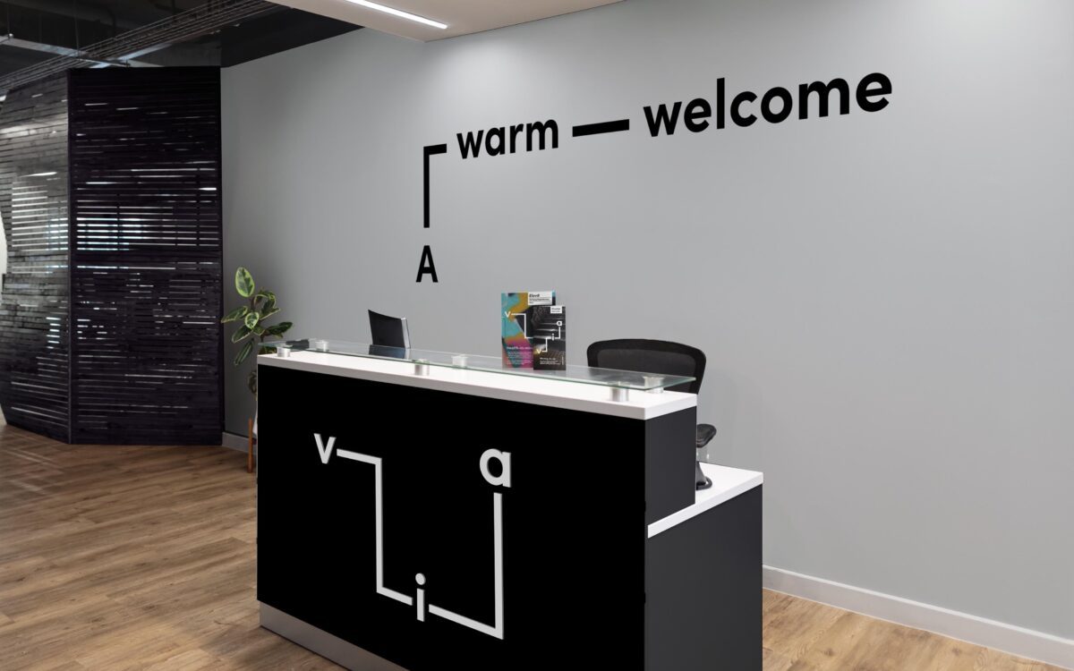
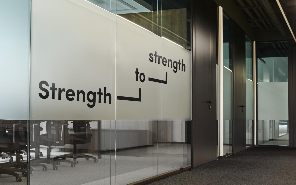
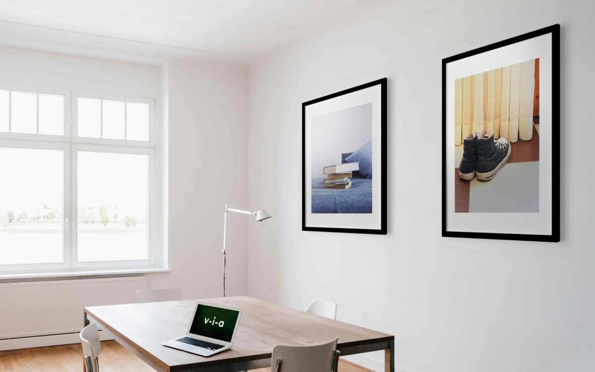
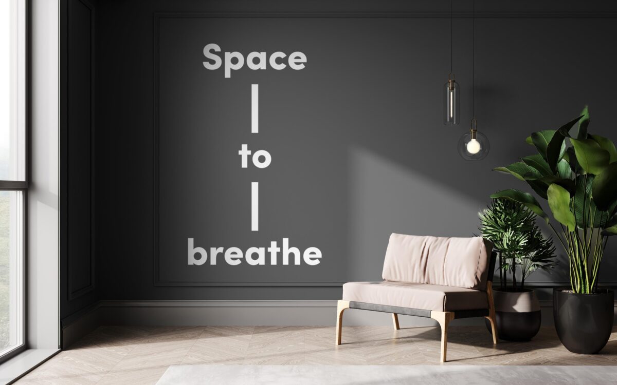
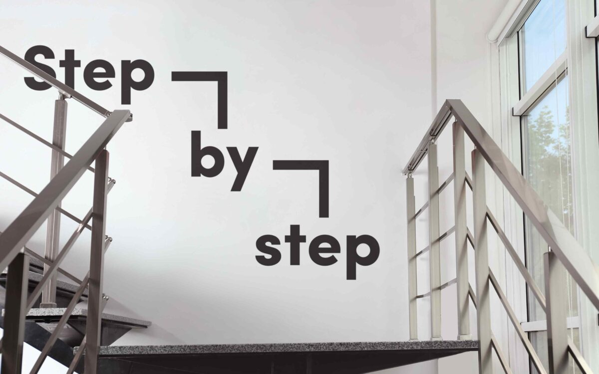

It was important that the brand elements were brought together coherently in Via’s service locations. The positive tone of voice has been applied throughout Via’s environments and appears alongside ‘Beauty in the everyday’ imagery to help create contemporary, welcoming and uplifting spaces.
Our new brand really reflects the voices of the people who use our services, those that commission or partner with us and those who work for the organisation. ASHA & Co partnered with us to create something really special in a field where people typically feel undervalued and are impacted by stigma. What they delivered challenges that and conveys value and optimism – that’s exactly what was needed.
Anna Whitton – CEO, Via
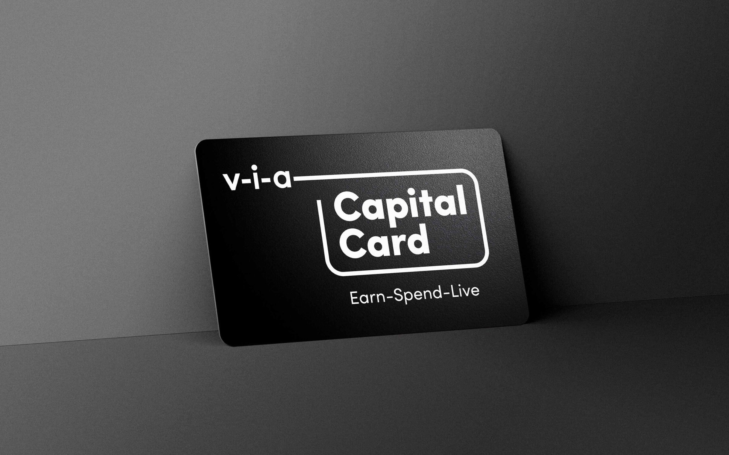
As part of the Via brand architecture work, we created the branding for CapitalCard, one of their flagship products. Extending the line from the logo to surround the brand name, we created a strong link to the master-brand. Flexible in its delivery, this idea allows Via to launch new products using the same system.
Working closely with Via’s internal design team we developed a suite of templates to be used across individual service locations. Assets were created to enable designs for service locations around the country to be delivered consistently. Going forward, these will be made available to customise and download from online portals.
The team at Asha & Co really took the time to understand who we are and why we do what we do. They found a way to reflect that in the brand and it really resonates.
Anna Whitton – CEO, Via
In awarding Via a Gold accreditation, Investors in People noted that what most people were proud of was “the new brand” and that: “everybody is now absolutely bought in and feels that it beautifully reflects the role that the organisation plays in helping people on their journey to live more fulfilling and independent lives.”

“In 2024-25 we are growing by around 38%. This is very significant growth, a significant proportion of which is associated with winning a large rural contract in South West England. Our new name undoubtably contributed to that success, enabling us to reach more people and have greater positive impact as an organisation.”
The rebrand also played a significant part in Via’s acquisition of Awakn Life Sciences, London; a biotechnology company developing therapeutics to treat addiction. ASHA & Co has been engaged to rename and reposition the new clinic.

