Client
YMCA
Founded in 1844, YMCA’s history – and that song – meant that they were one of the top 20% of charities for recognition, but in the bottom 10% for awareness of what they do. As a federation of 121 separate charities, YMCA needed a national brand which could be adopted by each member. Together, we created an identity and positioning that unified all the disparate parts of the organisation. We also helped to build the foundations on which they could communicate clearly with their target audience.
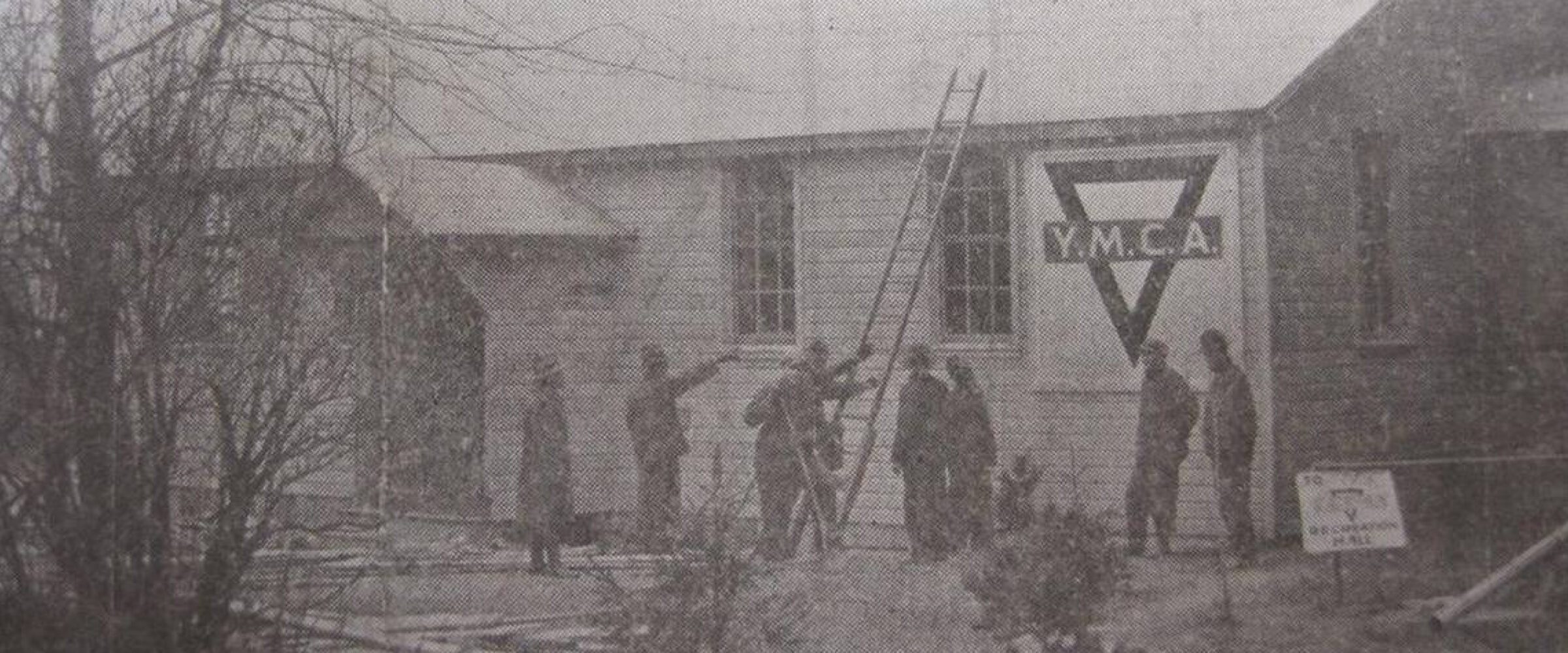
In 1844 George Williams founded YMCA out of concern for the welfare of young apprentices living in London with the goal of helping them live more wholesome and fulfilled lives. Today, YMCA in England is a federation of locally-based charities that strive to transform and enrich the lives of young people by creating places of belonging, support and inspiration in their communities.
YMCA came to us after recognising that it was failing to get a clear message across to the public, and this was affecting its share of charitable donations and the effectiveness of its work.
The charity’s acronym originally stood for ‘Young Men’s Christian Association’. Over time, the relevance of this definition had diminished. We established a new meaning and direction for the charity: ‘Youth Minded Community Approach’. This provided the focal point for linking everything YMCA does and how they express their brand.
We identified that YMCA is a prolific deliverer of services into the community, caters to a wide range of age groups and audiences and operates with real local emphasis – all of which was creating confusion – both externally and internally.
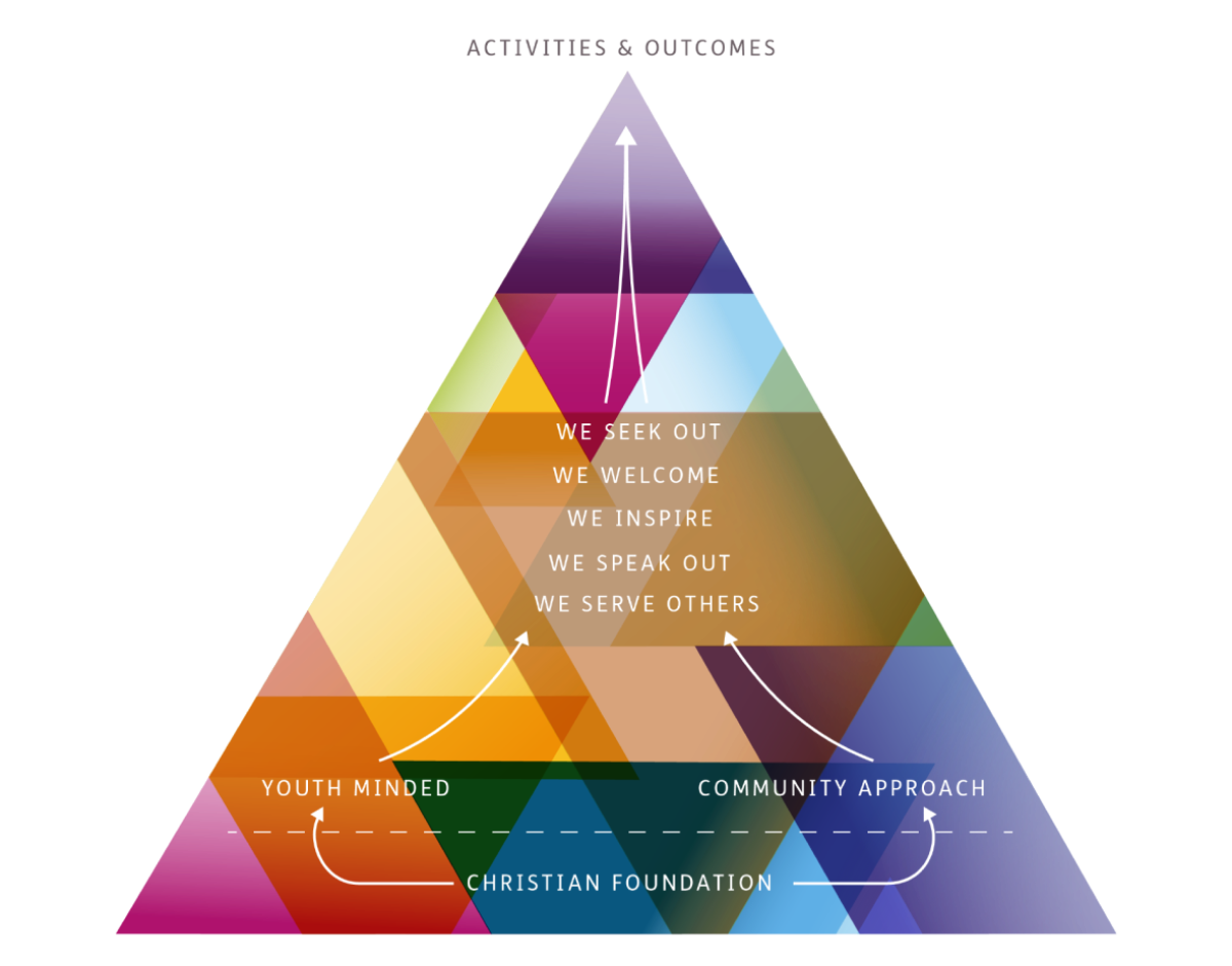

We undertook a comprehensive audit with the organisation which enabled us to bring more definition to what it is YMCA does. We helped them define five categories which encompassed all their activities.
Each category was underpinned by a core belief which could drive the behaviour of the charity and give it focus. Colourways were assigned to each area of work to enable more targeted communication.
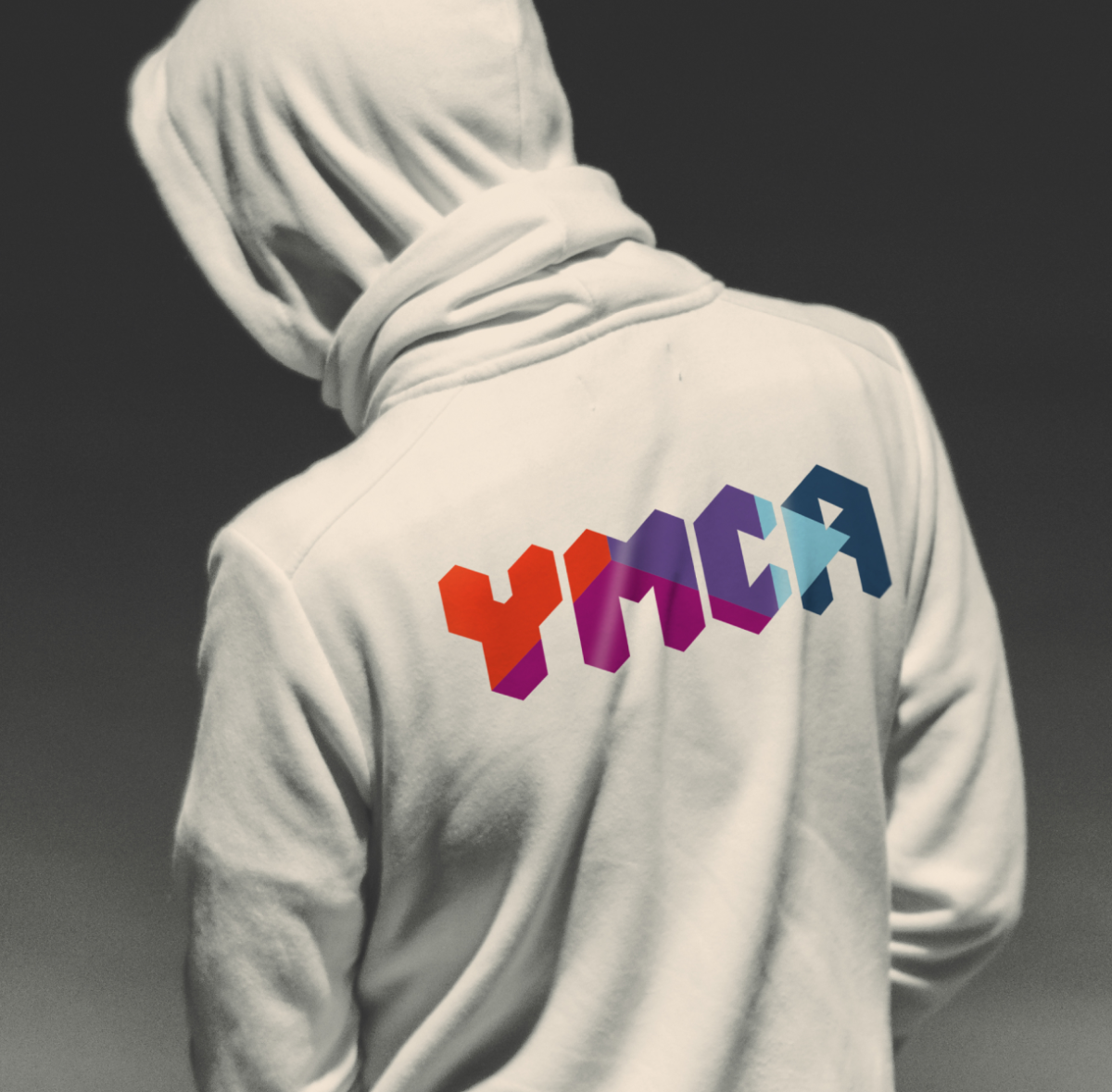
The equilateral triangle, originally used to symbolise the values of Body, Mind and Spirit, provides a link back to the organisation’s founding principles. Our creative strategy used the longstanding triangle in a number of different ways. We used it as a building block to create the new logotype. It helped in the composition of brand photography. And it became a graphic tool for housing key messaging and pointing to an outcome.
The brand identity system provided the toolkit for verbally and visually expressing the brand across the Federation website, the local member websites, signage, uniforms, literature and stationery, retail environments and sub-branding.


The detailed and flexible system that we created for signage has enabled any YMCA in the Federation to fit out their building with branding and wayfinding in a range of materials from a list of approved suppliers. Our guideline ensures that brand consistency is maintained no matter what the location or size of the facility.
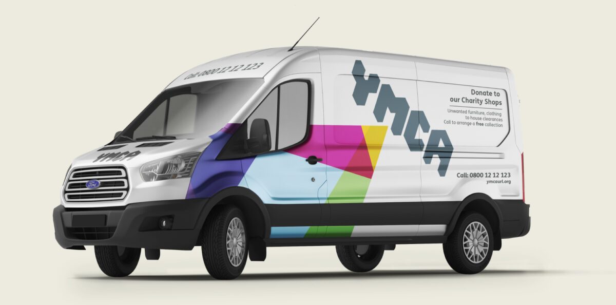
The charity has a large fleet of vehicles which bring much needed revenue by collecting larger, donated items for sale in YMCA branded stores. To make the most of the opportunity to raise the local profile of the brand, we designed a system so that livery could be consistently applied whilst still giving a choice of colours to wrap the vans in.
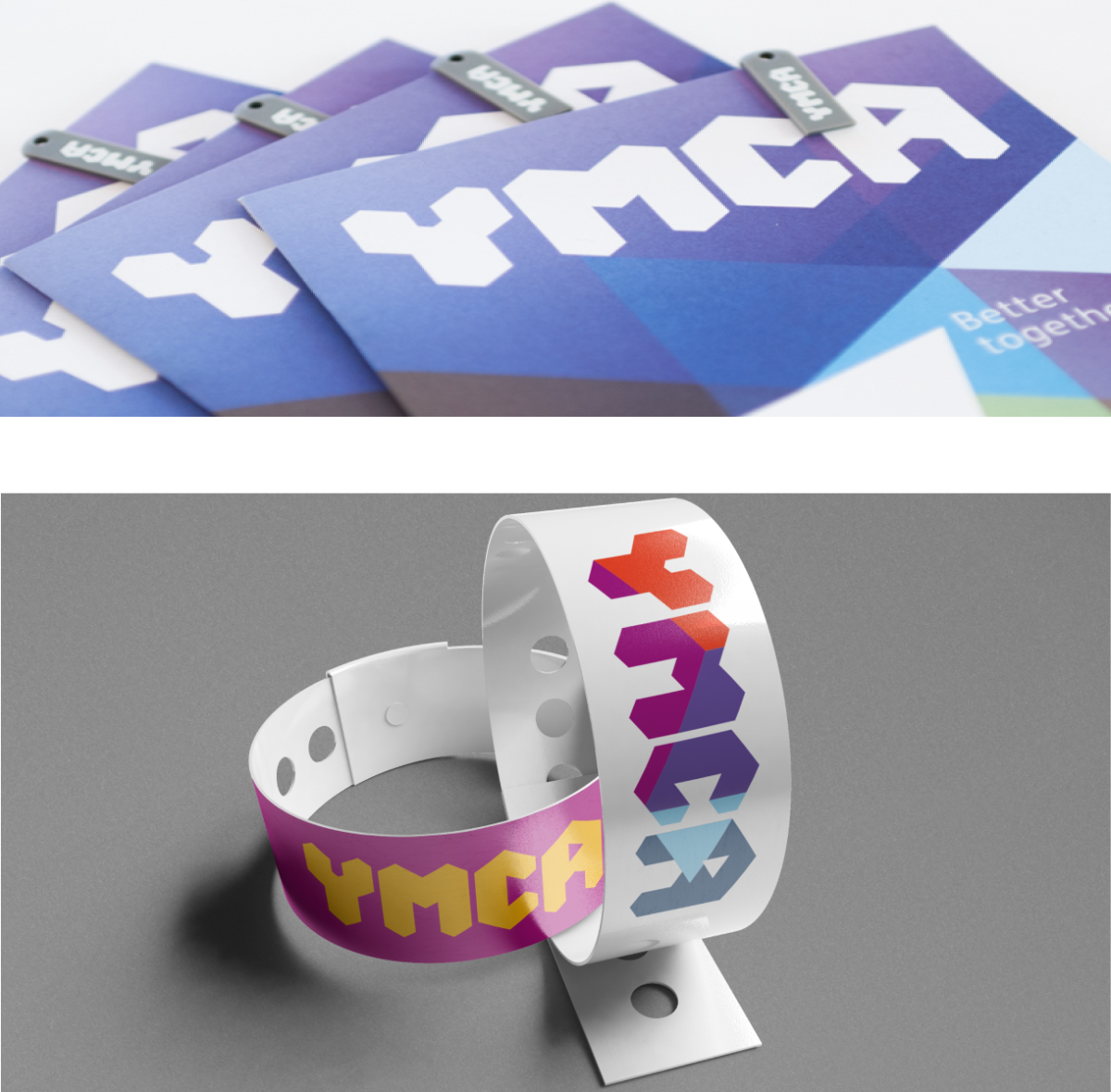
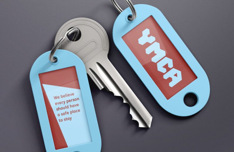
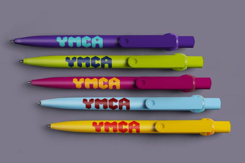
The wide range of branded merchandise enables YMCA staff and volunteers to carry a visual presence into their communities. A central, online merchandise hub now provides all the pens, shirts, badges and bottles the localised charities need to reinforce their brand consistently and recognisably.
Centralised templates were created to enable local YMCAs to build their own literature as required. Using an online hub has helped the organisation streamline their costs whilst maintaining maximum brand impact and visual consistency.
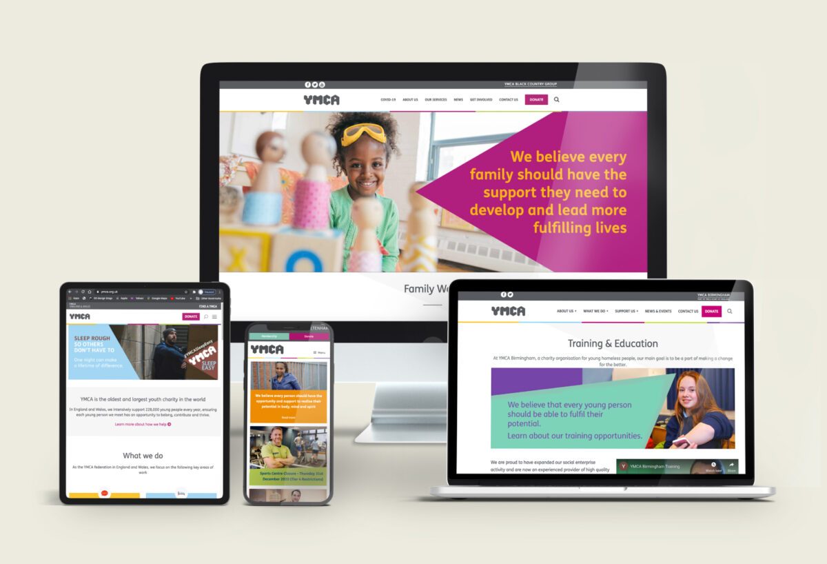
In addition to producing a detailed framework and set of principles for a range of touchpoints including workwear, we worked with YMCA to give their online environment consistency, creating templates for local organisations to build their own websites and guidelines to help them populate the sites with content.
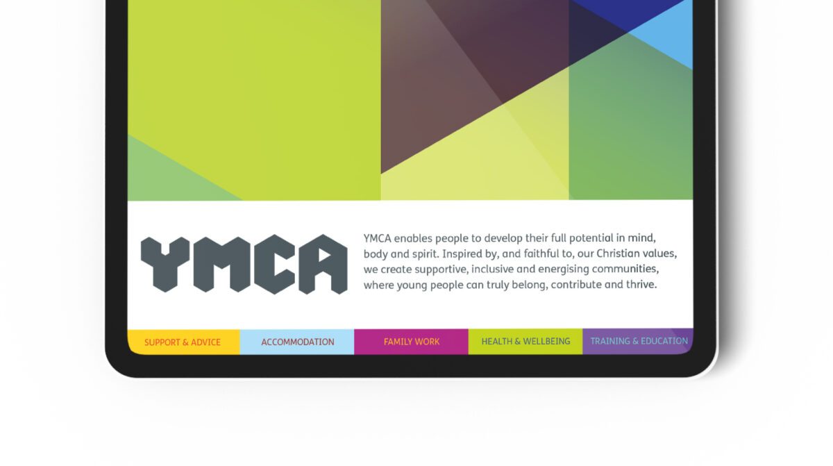
From nursery groups and toddler drop-in sessions to gym classes and family mediation, the YMCA provides a wide range of services to the communities it serves. To help the charity communicate this wealth of resources in an ownable and coherent way, we undertook a comprehensive brand architecture excercise. This provided a clear information hierarchy which incorporated naming and locations as well as a defined, iconic illustration style to bring services to life.
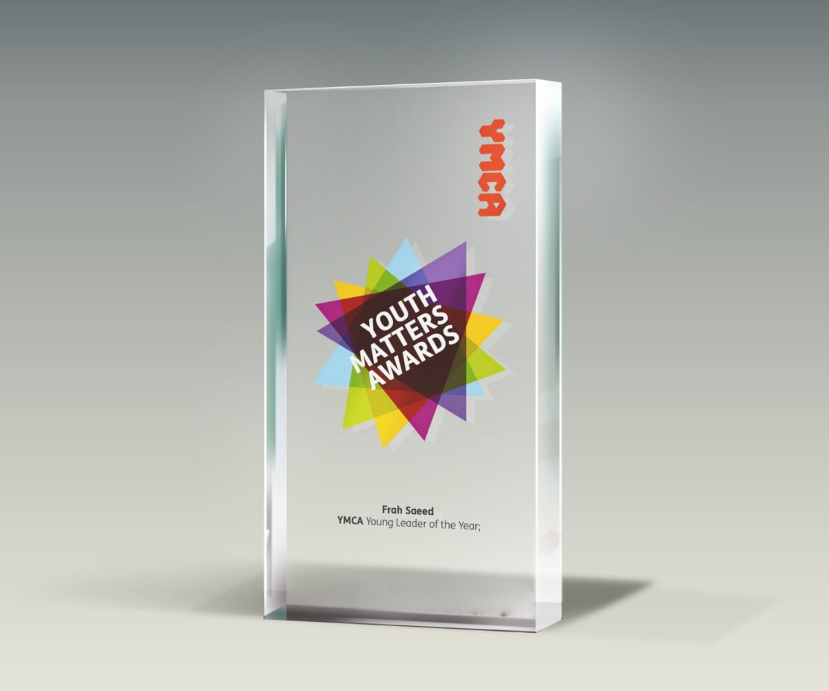
We created sub-brand identities for some of the main fundraising and recognition activities that the YMCA undertakes through out the year such as Tour De Y, Sleep Easy and the Youth Matters Awards which celebrate the “outstanding achievements, inspiring feats against adversity and tireless dedication to provoke change” of young people, YMCA staff and volunteers.
A distinctive partnership mark was also created for application on other organisation’s collateral.
I am incredibly pleased with how things have gone and the response that the brand has elicited. You would have loved to hear the comments at our recent National Conference – the shift in thinking here and the unifying power of the new brand is nothing short of phenomenal.
Kath Mills, Head of Communications

Community Spirit
Overall, the project has created the backbone for a brand with national consistency and strength. The charity now has the power to campaign, fundraise and act with a unified voice and purpose. Engaging audiences and gathering support from local communities to national government.